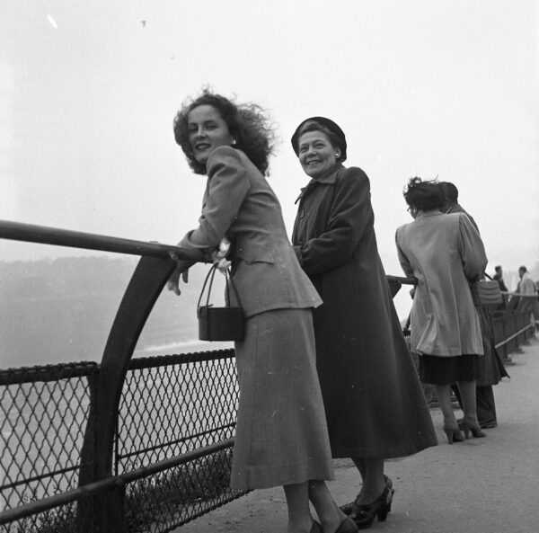
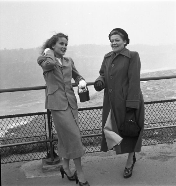
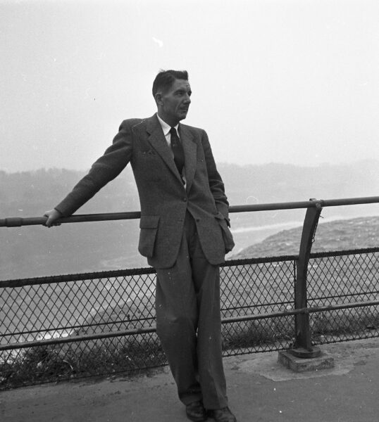
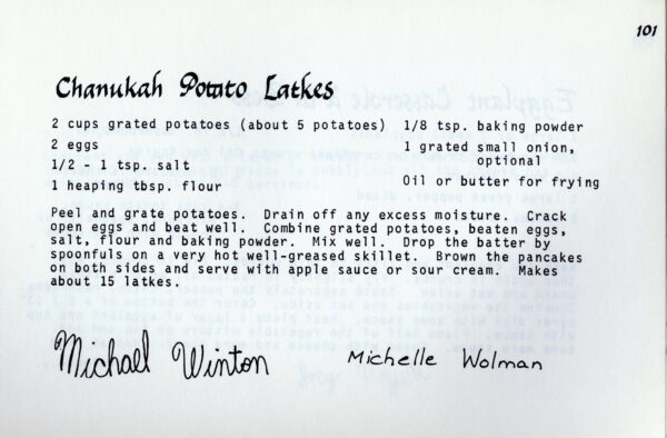
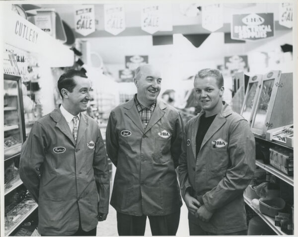
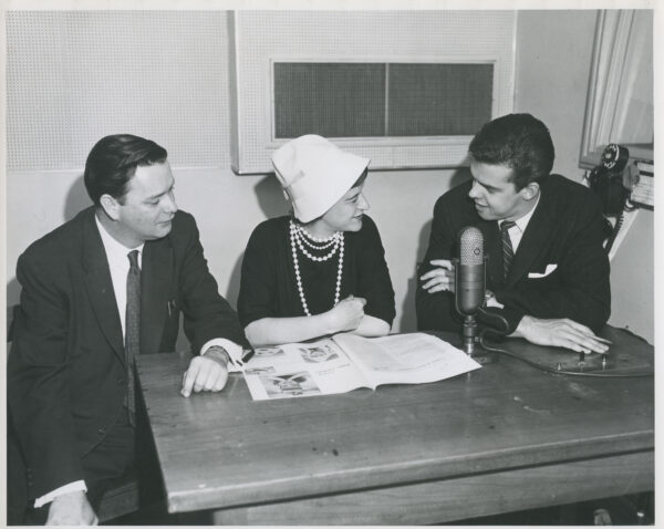
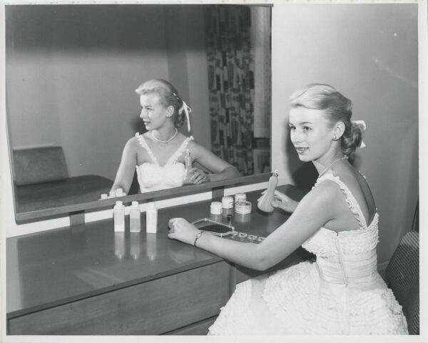
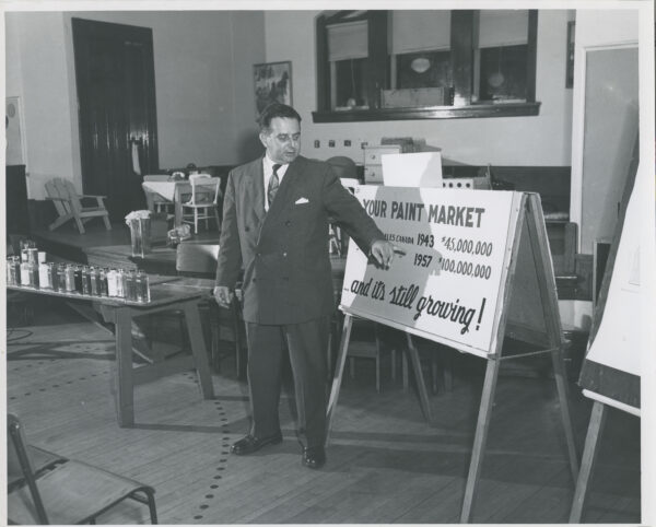
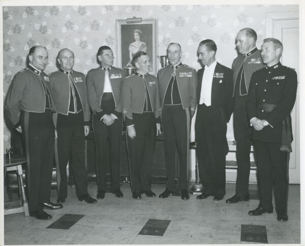
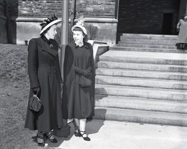
When I come across Grant Collingwood’s photographs from the 1940s and 1950s, I often admire that people are dressed in similar threads. Omnipresent in his early work are the tailored suits that are the true stars of the show. The cinched waist jacket, tweed with suede felted elbows, and just a few buttons at the navel, accompanied by a skirt just below the knees, usually paired with a hat; pillbox or beret, take your pick if not for the pincurls to win in the end.
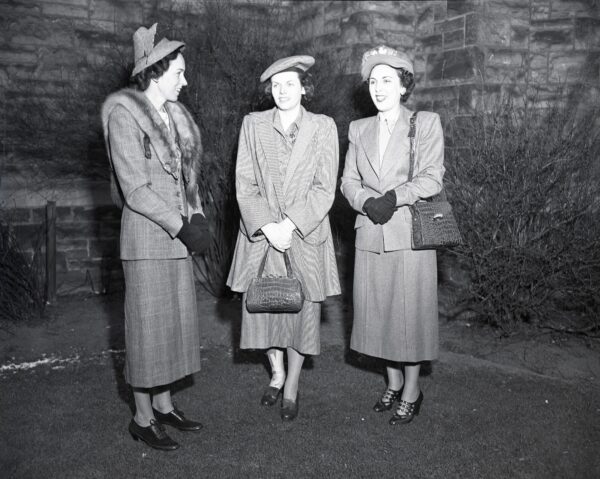
For a really special occasion, a taxidermy fox was slyly, and perhaps frighteningly, draped around the neck. After all, how was one to distinguish oneself from the 1940s Vogue encouraged wartime utilitarian silhouette? Although it’s not my style, I am often fascinated by the evidence of decades past and the ways in which fashion and gender roles solidified themselves in photographs, as seen with the war-time uniform. Consequently, Collingwood was such a prominent photographer, he captured so many fashion waves, sometimes just incidentally.
The decades came and went, and their history and politics shaped fashion. Skirts inched up the leg in protests in the late 1940s, and they became known as “the mini” by the 1960s. Not long after men’s shorts followed in-suit. In the reverse, short hair grew longer for both men and women.
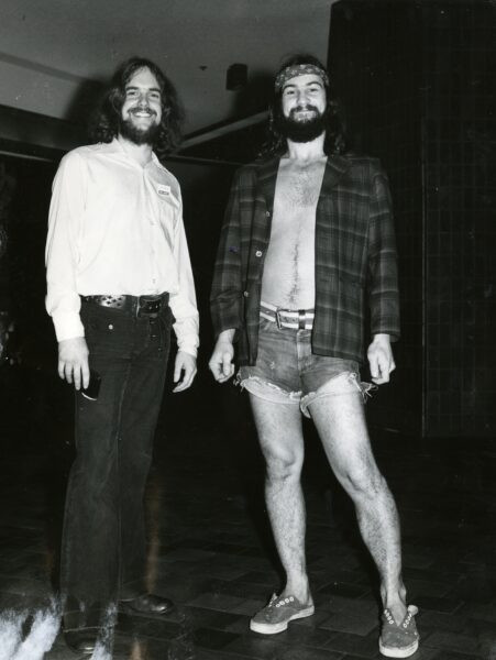
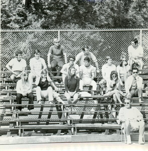
Shoes grew so many straps they birthed themselves into a sleek go-go boot. People lost their joie de vivre with hats, so the sun protective accessory inched down the face and transformed into statement sunglasses instead. The tweed went away and bold patterns took their place. Fashion became less about what to wear to work and serve your country in, and more about how to assert your civil rights, and with that the trends varied, the uniform disappeared and we were introduced to disco glam.
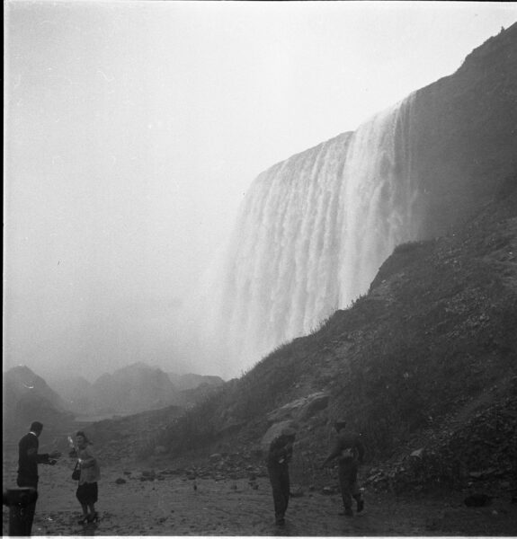
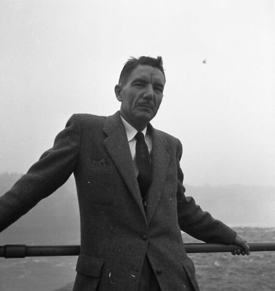
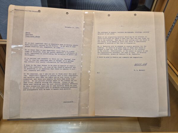
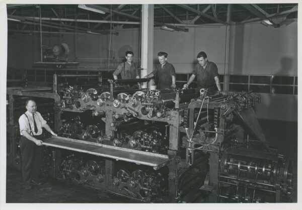
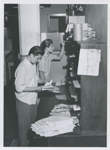
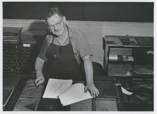
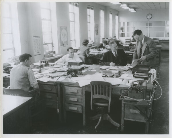
These snapshots are just a select few from over 30,000 in the collection to choose from. Most often, Collingwood organized his photographs and negatives by date which made accessioning them all the more easy. Sometimes, however, we are met with a box of undated work where fashion trends graciously allow us to rely on them to anchor the photograph into a decade.
References:
Ramzi, Lilah. “A 1960s Fashion History Lesson: Mini Skirts, Mods, and The Birth of Boho,” Vogue, May 1, 20234. https://www.vogue.com/article/1960s-fashion-history-lesson
Ramzi, Lilah. “A 1940s Fashion History Lesson: Wartime Utility Suits, the New Look, and More Trends of the Decade,” Vogue, April 19, 2024. https://www.vogue.com/article/1940s-fashion-history-lesson
Victoria and Albert Museum. “An introduction to 1960s fashion,” Last modified April 17, 2024. https://www.vam.ac.uk/articles/an-introduction-to-1960s-fashion
Marisa Kelly is a second-year Master’s student in the Film + Photography Preservation and Collections Management program. She is completing her six-month residency at Special Collections, where she has worked closely with the Grant Collingwood photographic fonds and the Canadian Architect magazine fonds. She holds her Bachelor of Arts (Honours) in Visual and Critical studies from OCAD University.