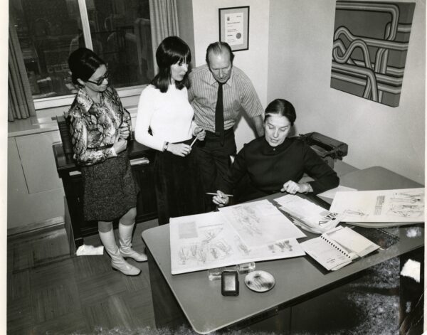
Spring/Summer hours (May 4 - Aug 31): Monday to Friday 9am - 4pm, by appointment only. To schedule an appointment, please fill out our appointment form or email us at asc@torontomu.ca
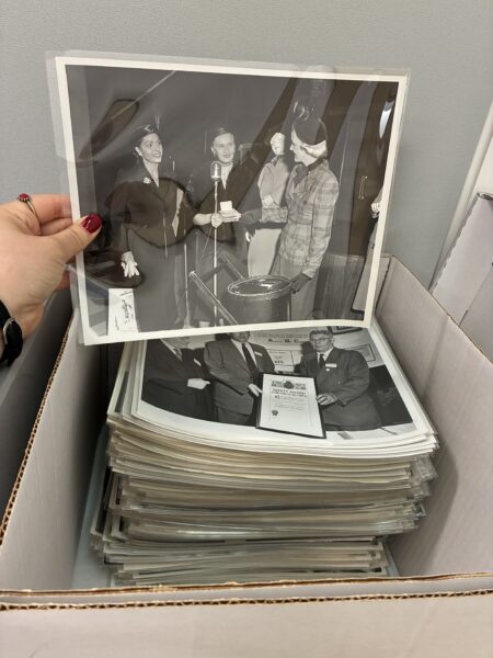
In 2021, the Special Collections accepted a donation of 35854 photographs of the late Canadian photographer Grant Collingwood. Approximately 31788 of those were various sized negatives, and only 4066 were photographic prints. Over the last five years, the Special Collections staff, Young Canada Works interns, and placement students of Toronto Metropolitan University’s Film and Photography Preservation and Collections Management (F+PPCM) program have sequentially collaborated with one another by cataloging and re-housing the thousands of materials. Ultimately, passing the Collingwood baton off and leaving behind notes of advice to support the next project archivist.
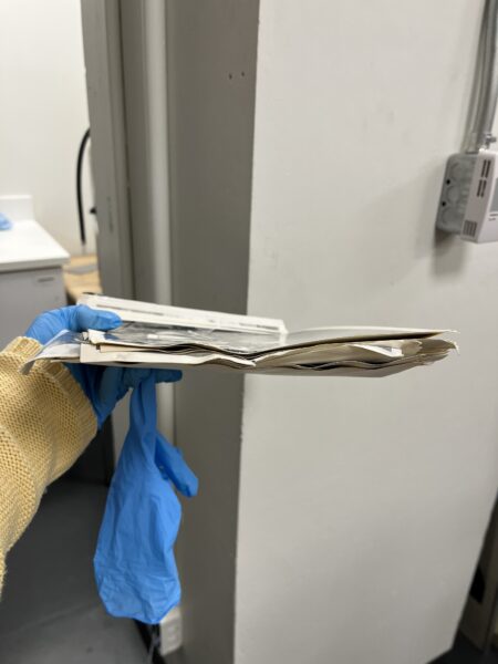
Over time, not only have filled bankers boxes transformed into orderly archival document cases, but archivists have learned new skills: how to read cursive handwriting, how to infer decades by utilizing context clues in the photographs when no handwritten date is available, and various conservation methods to unstick film negatives. The advice left behind has come in especially handy, as in the Spring of 2026 I opened a bankers box to have it reveal stacks of approximately 570 gelatin silver prints, none of which were dated and all of which were stuck together from water damage. Throwing them out would be a disservice to Special Collections as it was 14% of the prints in the Collingwood collection. It would also be a disservice to researchers. Was it worth the risk of throwing them out and losing documents of research value? We decided that it was not.
The first attempt to unstick the gelatin silver prints was to use the humidity chamber materials that were left behind by the Summer 2025 F+PPCM placement student. She learned the conservation of unsticking damaged negatives. I followed her instructions, I used a clear storage box that was 7 inches deep, I placed a microfiber cloth at the bottom. I poured in hot water from the kettle to be absorbed by the cloth, and I placed a metal shelf organizer from Ikea and on top and left the gelatin silver prints to rest. I sealed the lid of the box and plastic wrapped the entire unit to ensure the humidity stayed inside of the chamber. Unfortunately, due to the severe damage done to the gelatin silver prints, the humidity was not successful in releasing them from one another the way it had for the negatives, they remained stuck and hard as a rock.
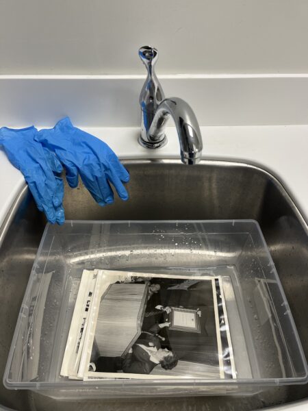
The Special Collections team used our photography backgrounds to decide on the next steps to take. With some additional research, we agreed that gelatin silver prints could be saved the same way in which they are made in the darkroom; by submerging them in water and laying them flat to dry. It felt risky to put archival documents into a wet bath, when liquid near any archival documents is often strictly forbidden. However, since the alternative was to just throw them away, we decided it was worth the risk. Before purchasing the additional supplies, we were fortunate to borrow equipment from the Technology Resource Centre (TRC) at the university as they have the supplies needed for the darkroom on campus. We borrowed a 16” x 20” developing tray, one set of print tongs, and a multi-purpose squeegee. We could not complete this without an acrylic sheet. Since the TRC did not have this available, we purchased an acrylic serving tray from our nearby dollar store. We also could not complete this without materials to suspend prints so that they did not stick to the table when drying, so we purchased a ‘fine screen roll’ from the nearby Canadian Tire used for common household windows.
I filled the development tray with warm water and submerged the gelatin silver prints. I monitored them to see if they would lift, and we were correct in our hypothesis as the water encouraged them to go from hard as a rock to silky and slippery and I was able to pull them apart with the print tongs. Separating them one by one, I walked them individually by holding the corners of the print like I would the train of a delicate wedding dress. I placed them on a window screen which fit about thirty prints and took anywhere from half a day to a full day for them to dry. In our newfound success, we returned the materials to the TRC and purchased our own supplies to have indefinitely.
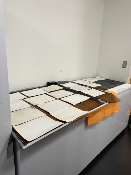
Since the prints were stuck together in various piles, all of which were inconsistently numbered, I used the humidity chamber to keep the stack of prints moist when needed, as allowing them to fully dry out and re-wet would cause further damage. I was also careful to not have them be left wet over the weekend, as extended periods of dampness and humidity made the emulsion lift off and ruined the entire photograph. The wet-to-dried prints were not sticky, and it caused no issues to stack them on one another. Although many of the prints did curl up, by layering them between acid free folders that hugged the prints, using layered acid free boards, and various sized archival or gym weights sitting atop, we pressed them for a week and they flattened right down. At last, we stored them in individual archival safe plastic sleeves and prepped them to be catalogued.
As there were 570 prints to re-wet and pull apart, the project took four months to complete, starting in March and ending in June. The project was so successful that only a fair few prints did not make the cut and were thrown out in the process. However, as none of the prints have a date scrawled across the back of them, it will be a task passed off to the next project archivist to determine what decade they belong to for our arrangement which is chronological order by year and subdivided by subject matter. And just like that, the Collingwood baton is passed off to continue its project archivist relay race.
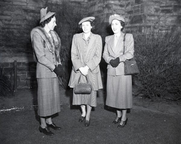
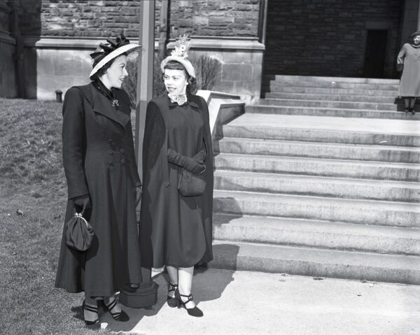
When I come across Grant Collingwood’s photographs from the 1940s and 1950s, I often admire that people are dressed in similar threads. Omnipresent in his early work are the tailored suits that are the true stars of the show. The cinched waist jacket, tweed with suede felted elbows, and just a few buttons at the navel, accompanied by a skirt just below the knees, usually paired with a hat; pillbox or beret, take your pick if not for the pincurls to win in the end.
For a really special occasion, a taxidermy fox was slyly, and perhaps frighteningly, draped around the neck. After all, how was one to distinguish oneself from the 1940s Vogue encouraged wartime utilitarian silhouette? Although it’s not my style, I am often fascinated by the evidence of decades past and the ways in which fashion and gender roles solidified themselves in photographs, as seen with the war-time uniform. Consequently, Collingwood was such a prominent photographer, he captured so many fashion waves, sometimes just incidentally.
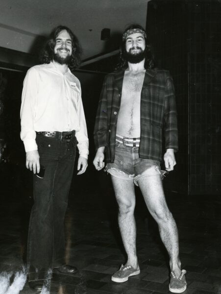
The decades came and went, and their history and politics shaped fashion. Skirts inched up the leg in protests in the late 1940s, and they became known as “the mini” by the 1960s. Not long after men’s shorts followed in-suit. In the reverse, short hair grew longer for both men and women.
Shoes grew so many straps they birthed themselves into a sleek go-go boot. People lost their joie de vivre with hats, so the sun protective accessory inched down the face and transformed into statement sunglasses instead. The tweed went away and bold patterns took their place. Fashion became less about what to wear to work and serve your country in, and more about how to assert your civil rights, and with that the trends varied, the uniform disappeared and we were introduced to disco glam.
These snapshots are just a select few from over 30,000 in the collection to choose from. Most often, Collingwood organized his photographs and negatives by date which made accessioning them all the more easy. Sometimes, however, we are met with a box of undated work where fashion trends graciously allow us to rely on them to anchor the photograph into a decade.
Marisa Kelly is a second-year Master’s student in the Film + Photography Preservation and Collections Management program. She is completing her six-month residency at Special Collections, where she has worked closely with the Grant Collingwood photographic fonds and the Canadian Architect magazine fonds. She holds her Bachelor of Arts (Honours) in Visual and Critical studies from OCAD University.
Opening a bankers box to re-house Canadian photographer Grant Collingwood’s collection of film negatives is met with an exciting luck of the draw, as each box contains hundreds of closed envelopes with subject matter that varies from one envelope to the next.
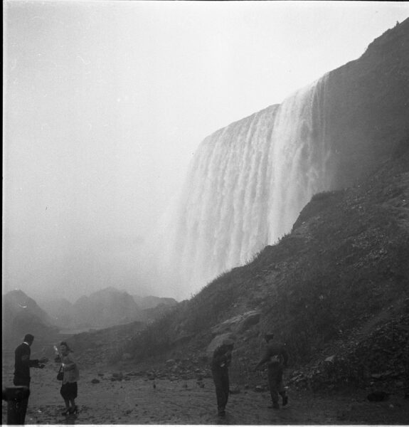
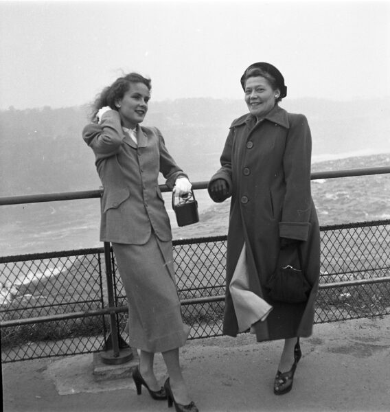
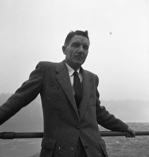
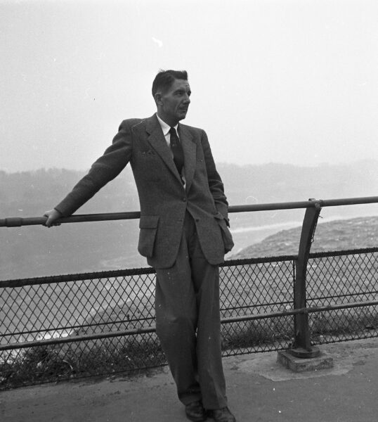
Collingwood’s career spanned about five decades (1940s–1990s), during which, to his credit, he titled the housings in which his negatives were kept by name of the person or the content, and always by the year that it was taken. Even so, Collingwood was a busy man, and as such, his photographic content varied considerably. In 1952 alone, he was commissioned to capture a variety of subjects, including graduations, wedding anniversaries, personal portraits, and commercial booths at the Canadian National Exhibition (CNE), among others. However, in pockets between work, he found time for leisure, and on an overcast day in November of 1952 off he went with friends to photograph the monumental magic that is Niagara Falls.
The Falls themselves have roots in Indigenous culture and story telling, and hold their own various documentation; spanning from tourist photographs, daredevil attempts, and attractions such as the Maid of the Mist and Journey Behind The Falls.
From the early Onguiaahra Indigenous tribes in the region, their word “Ongiara” evolved into “Niagara” by way of mispronunciation done by French colonists. It translates to “Thunder of Waters,” and according to the Niagara Falls National Heritage Area, it is estimated that every second, 3,160 tons of water flow over the Falls, totalling 75,750 gallons over the American and Bridal Veil Falls and 681,750 gallons over the Horseshoe Falls. So, as I pulled out a perfectly square 6 x 6 negative from one of Collingwood’s envelopes titled “At Niagara Falls” I gawped at the photograph of Collingwood and others at the bottom of the vast waterfall, with seemingly just a small rubble hill and some rocky earth between them and the roaring water.
From Below the Falls, Grant Collingwood Collection.
Joan and Mrs. Curtis, Grant Collingwood Collection.
Joan and Mrs. Curtis, Grant Collingwood Collection.
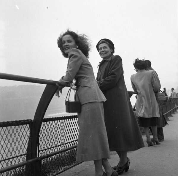
Posed Beside the Falls, Grant Collingwood Collection.
Posed Beside the Falls, Grant Collingwood Collection.
As I sifted through the additional photographs, I admired the posed portraits of wind swept hair, posh shoulder padded jackets, trench coats with voluminous buttons, suit jackets and ties, and vintage square totes in tow with people all along a fenced pathway so close to the waters edge they could reach out and touch it.
Seven years later, in June 1959, the New York Times reported on tourist renovations on Niagara Falls and its surrounding areas. Today, a tourist can book a paid ticket for Journey Behind The Falls and view the Horseshoe Falls from behind a tunnel cozied in a rain coat. But, in 1952, it seems one would have to look no further than to wander onto the sandy earth, and true to 1950s fashion and technology, a closer look at the photograph below the Falls reveals a woman walking the terrain in heels and a man with what appears to be a Rolleiflex at his chest, also wishing to capture the event. Nothing like taking a trip for a simple jaunt out on the day to observe a nearby Natural Wonder of the World.
Marisa Kelly is a second-year Master’s student in the Film + Photography Preservation and Collections Management program. She is completing her six-month residency at Special Collections, where she has worked closely with the Grant Collingwood photographic fonds and the Canadian Architect magazine fonds. She holds her Bachelor of Arts (Honours) in Visual and Critical studies from OCAD University.
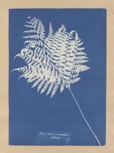
The colour blue connotes many things: emotion, temperature, depth, space. When a picture is washed in blue, it might feel melancholic and sad, or vast and optimistic like an open sky. In art, blue can be associated with Picasso’s blue period, or the Virgin Mary who is often garbed in blue cloth. When one thinks of blue in photography, they might think of colour as a whole, the alternative to black and white photography. Instead, let’s think of cyanotype.
Cyanotype is a photographic printing process invented in 1842 by Sir John Herschel. It is characterised by its striking blue monochrome. It is a relatively simple developing process, but never gained large momentum in the photographic world due to its distinctive colour. It instead became popular with architects and draughtspeople since it is considered the first photocopying process and is also known as blueprints. This is where we get the term ‘Blueprint’ from, the cyanotype copy of the original architectural drawing.
Sir John Herschel was a pioneer of photography. He was one of the many inventors racing to come up with a means to permanently capture an image. Though he helped others who have been credited with the invention of photography, he is solely credited with cyanotype. The process was not popular when it was introduced. Many were not a fan of the deep blue colour, preferring the more neutral black and browns seen in contemporary photography of the time. Instead, it was picked up by botanists to document and share the natural world.
Anna Children Atkins was a British botanist. She used cyanotype to copy images of plants, allowing her to better study their physical characteristics. Atkins studied botany during the 19th century, a time when women were pushed away from many scientific fields. She published “British Algae” in 1843, which was composed of many cyanotypes and captured the forms of algae and other plants in Britain.
The distinctive blue colour is not all that characterises cyanotypes. Like many prints and photographs, cyanotypes fade when exposed to light. Their blue becomes dull and grey, reduced to a faded white. This can all be easily reversed – which is unique to these blue toned images. The blue will reappear after the image has been placed in darkness. Though light is often a danger to fine art and photography, it is only a temporary nuisance for cyanotypes.
From their invention in the mid 19th century, cyanotypes have been a niche photographic process. Their striking blue tones are beautiful, and faded colour can be brought back by some time away from light. Come see a sample of the cyanotypes in TMU’s Special Collections this January. Take inspiration from its scientific history, its use in artist photographs, its popularity in architecture, or simply enjoy its blue hues.
T’was a dark and stormy night… After a lovely roast dinner with your extended family, you all settle around a cozy fire in the parlor, sipping digestifs and listening intently as the older members of your family reminisce about times long gone by. Happy stories, sad stories, tales of love and loss… You are snapped out of your dreamy daze when your grandmother places her slender fingers on your shoulder.
“Do you mind grabbing some boxes from the cellar, dear? I’d love to show everyone your grandfather’s old motorcycle. Oh! And that house we had on the cul-de-sac.” Ear-splitting thunder startles you further, but you softly nod and get up from the couch.
You push the basement door open and it whines loudly, as if in protest of your actions. You are unsure of the last time anyone has stepped foot in the unfinished basement, and the cobwebs and smell of mildew are not encouraging. You pad down the stairs and approach a box labelled “photos and film.” The pen strokes are fuzzy from years of humidity and water stains are visible almost half way up the box. You open it up to ensure its contents, but something hits you, the sour and offensive stench of vinegar. The hairs on the back of your neck stand up as you reach to pick up a stack of film negatives. Frightening shades of bright blue meet your eyes, deep ridges in the delicate negatives threaten to split from your touch, emulsion adheres to emulsion, and the figures captured in each photo have faded beyond recognition. You gasp loudly and drop the stack of negatives back into the box. How could this happen? Decades of images, beautiful moments frozen in time, quietly lost to the standard environment of a damp basement. How could this happen?
What is vinegar syndrome?
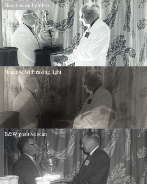
Cellulose acetate film began to be widely used by 1952 after Kodak completed a four year long conversion program to replace nitrocellulose (nitrate) film which is known for its extreme flammability. Acetate film can be identified by the words “safety” printed along the edge of the film, dating information that matches with its advent, or destructive tests such as the float or burn test. Unlike nitrate film, the chemical composition of acetate film allows it to melt instead of burn, however, it is this composition that ultimately leads to its often unexpected demise. The chemical reaction that leads to the deterioration of acetate film begins when the acetate ions are exposed to moisture and heat which produces acetic acid, also know as vinegar. This reaction is “autocatalytic,” meaning it feeds on itself, cannot be stopped once it has started, and will speed up over time. Library and Archives Canada represents the deterioration of acetate film from vinegar syndrome in six distinct stages:
Stage one, where vinegar syndrome can not be detected without acid detecting strips. The negative below is indistinguishable from a negative without vinegar syndrome.
Stage one vinegar syndrome
Stage two, where the film curls slightly and may have a slight smell of vinegar. The negative below was protected from curling due to being compressed in its original housing, however the raking light reveals some warping on the film base.
Stage two vinegar syndrome
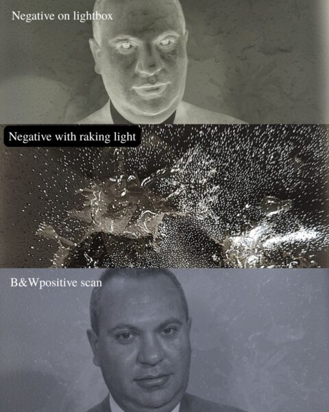
Stage three, where the smell of vinegar is present and the film begins to shrink, turn blue or pink, and becomes brittle. The negative below smells strongly of vinegar, has turned a deep shade of blue, which scans positively as orange, and has some ridges in the film base.
Stage three vinegar syndrome
Stage four, where the film begins to warp and the smell of vinegar is strong. This negative has a slight blue tinge, raised ridges in the film base, and is much more brittle than the previous three, making it difficult to handle.
Stage four vinegar syndrome
Stage five, where bubbles and crystalline deposits begin to form. This negative is dotted with hundreds of crystal deposits which compromise the image quality.
Stage five vinegar syndrome
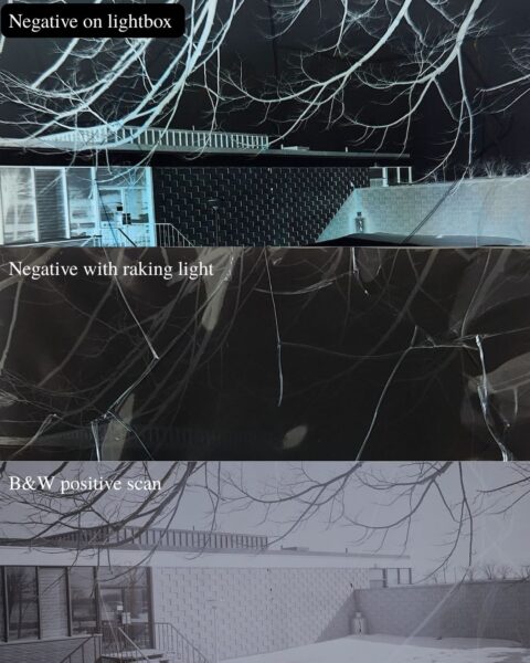
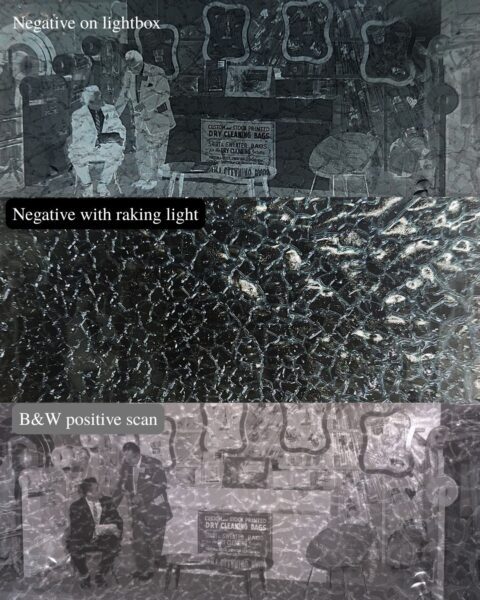
And finally, stage six, where the image may not be visible and channels form on the emulsion and film base sides. The image on this negative is still legible, but its quality has been drastically affected by the web-like channels, and crystal deposits.
Stage six vinegar syndrome
Upon first glance, one may find a strip of curling, discoloured film to look quite insignificant, but each negative is a fragment of a larger story. Many of these images capture moments that shaped individuals, communities, and entire eras. Without timely preservation, these images, prone to silent deterioration, can vanish, erasing moments that once meant the world to someone. Caring for a personal collection of negatives does not have to be complicated or expensive, and a little effort can go a long way when it comes to saving photographs for decades to come.
An at home guide to preserving cellulose acetate film
To begin with, the easiest step to taking care of your negatives is handling them as little as possible. Our touch leaves oils from our skin on materials which can exacerbate their deterioration. Utilizing nylon, nitrile, or cotton gloves are best practice for handling photographic negatives, however freshly washed hands are also appropriate in a pinch. Boxes, mat board, and polyester or polyethylene sleeves can also be used to buffer negatives from heat and moisture as well as to prevent mechanical damage such as scratches and tears. Chemically stable materials (for example: cotton rag or chemically purified wood pulp) such as mat board, boxes, and file folders are also helpful for buffering from moisture. All photographic materials, especially negatives, should be mounted using non-invasive techniques. Instead of adhering an image to paper, consider using photo corners.
All photographic materials are also susceptible to deterioration from exposure to heat and humidity, but acetate film is especially prone due to its tendency to develop vinegar syndrome. Storing negatives in a basement or attic may seem like a good way to keep boxes out of the way, but these humid places with little temperature control can be a disaster for your negatives. Storing your negatives in a dry, cool place can prevent or slow down the onset of vinegar syndrome. Acetate negatives should also be stored away from incandescent lights, windows, doors, radiators, heating ducts, skylights, and exterior walls. If a humid area is the only place available for storage, consider purchasing a dehumidifier to keep your negatives dry, and if you wished to go even further, lining a cabinet with silica gel or desiccated mat board can also help moderate humidity fluctuations.
While all of these methods can drastically extend the lifespan of your negatives, reformatting them is the only way to ensure the image outlasts the negative. Photographing or scanning your negatives and uploading them to a hard drive not only preserves what is depicted in the negative, it also offers the opportunity to dispose of any negatives that you may not be able to take care of, thus creating physical space for photographs in better condition.
How we take care of negatives with vinegar syndrome at A&SC
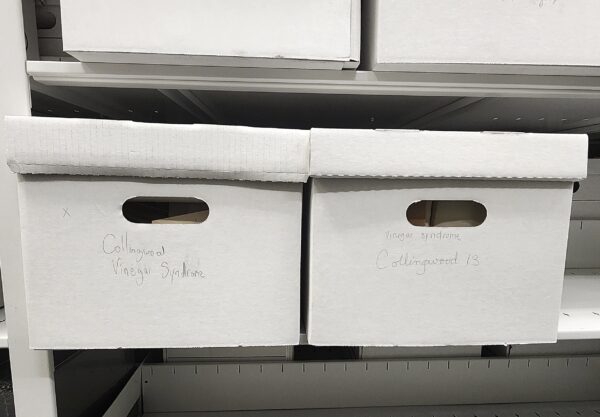
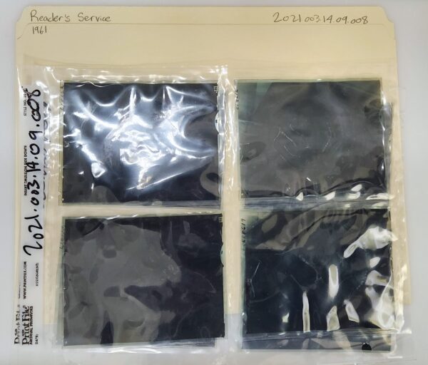
The first preservation step that is taken is isolating any film that may or may not have vinegar syndrome. This is due to vinegar syndrome’s tendency to spread to materials it is in close proximity with. Using the Collingwood collection as an example, any negatives with noticeable signs of deterioration were placed into separate boxes labelled “Vinegar Syndrome” until they are ready to be catalogued and housed.
Two boxes containing negatives with vinegar syndrome in the A&SC vault from the Collingwood collection
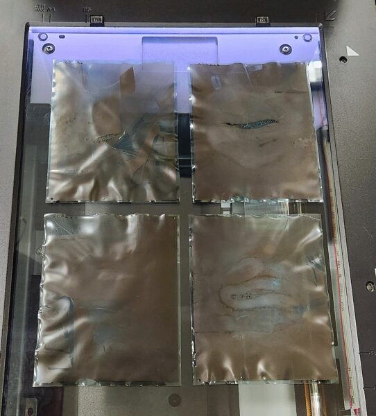
Each file is given a brief condition report specifying what stage of vinegar syndrome it is at before each negative is digitized. Due to their fragile nature, film holders can not be used to hold the negatives in place on the scanner and the negatives are instead carefully placed on the flatbed with some space between each other.
Four negatives with vinegar syndrome placed on a flatbed scanner.
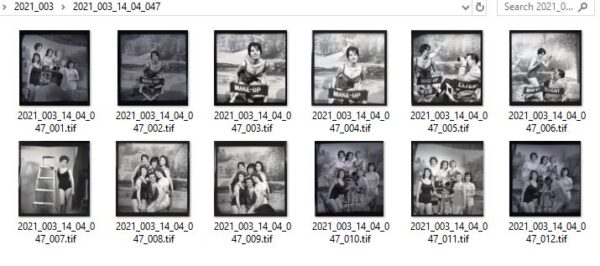
We scan images as TIFF files, which are the archival standard due to their lossless compression preserving more image data. Digitization is beneficial for a number of reasons including keeping track of object condition, lowering the amount of times the negative needs to be handled, and keeping the images accessible to staff and researchers even once they are in cold storage.
File folder for digitized images of 2021.003.14.04.047
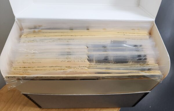
Once digitized, the negatives are slipped into archival quality plastic negative preservers where they are then placed into a file folder indicating its reference number, title, and year of creation. A stack of around sixty files, approximately 240 negatives, can fit into one legal-sized document box. Once a box has been filled, it is ready to be packaged for cold storage.
Negatives packaged in plastic sleeves
Finished legal sized document box
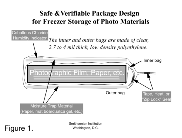
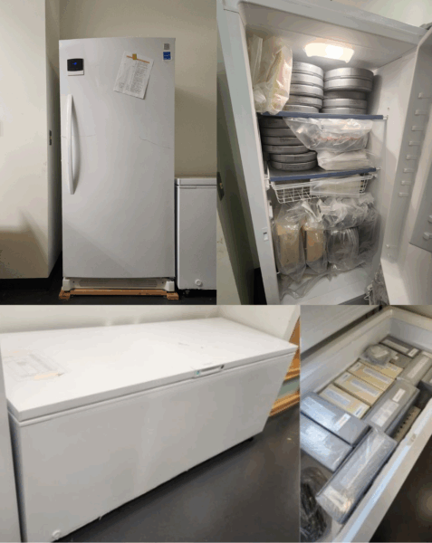
Cold storage slows vinegar syndrome by reducing the mobility of acetate ions and moisture in the film base, effectively putting the degradation process on pause. “It is important to note that cold storage cannot reverse the effects of vinegar syndrome, it only arrests further deterioration. Packaging the boxes correctly is incredibly important because their packaging needs to be semi-permeable to prevent moisture buildup. Any moisture that collects within the box and plastic will ultimately worsen the degradation of the negatives, and freezers, especially ones with high traffic, tend to be moist. The packaging method we use is the Mark McCormick-Goodhart Critical Moisture Barrier method, which utilizes two layers of low-density polyethylene, as well as a layer of four-ply desiccated mat board and a cobalt salt card placed between the polyethylene.
Critical moisture barrier package diagram
The polyethylene provides a semi-breathable wrapping, while the mat board acts as a moisture trap between the two layers of plastic. The cobalt salt card indicates the humidity percentage within the individual package by turning blue when exposed to moisture. We have one standing freezer and one chest freezer that are both kept around -12° Celsius, which is well within an acceptable range, however it should be noted that standards outlined by the Image Permanence Institute suggest that -18° Celsius and a relative humidity between 20 and 30 percent are ideal for negatives in cold storage. In an archive, achieving perfect conditions is often a balance of institutional resources and preservation priorities.
Standing freezer and chest freezer in A&SC vault
It is important to remember that cold storage is not the end of the preservation process, it is a long-term strategy to stabilize fragile materials. Once negatives are sealed in cold storage, we limit access to the physical object, offering the digitized copies instead, which minimizes the need for future handling. This ensures that even if a researcher is working with the material years from now, the original has not degraded further due to mechanical stress or temperature fluctuation.
Though vinegar syndrome may not stalk its victims like a monster from the shadows, its silent spread is just as chilling. The damage may seem invisible at first, but its impact is irreversible. Whether in a shoebox under the stairs or a meticulous archive, photographic negatives hold irreplaceable glimpses into the past. With just a few thoughtful steps, anyone can help stave off this creeping decay. So the next time you find yourself in a basement holding a box filled with old film, take a moment to ask yourself: “Is that just the damp smell of a basement, or is that the scent of vinegar in the air?”
If you are curious to see what vinegar syndrome looks like up close, come and visit the fourth floor of the library where our display windows outside the reading room feature real acetate negatives from the Collingwood collection in various stages of deterioration.
From dingy dive bars to iconic high-end clubs, Toronto’s streets buzzed with the sounds of thumping double basses, crooning vocals, and blaring saxophones throughout the 1980s. Jazz, blues, soul, and ska became the soundtrack for many Torontonians looking for an atmospheric night out, gradually shaping the cultural identity of a city finding its rhythm. While this musical landscape is a bygone era, glimpses of those memorable nights live on through photographs such as those found in the Collingwood Collection, currently being processed at the Toronto Metropolitan University Archives and Special Collections.
Spanning the 1940s to the 1990s, the Collingwood Collection consists of thousands of photographic negatives, prints, and textual records, many documenting Toronto’s evolving cultural landscape. Among them are images from local jazz venues such as The Brunswick House and Bourbon St., as well as captivating portraits of performers like The Mighty Pope, Sarah Vaughan, and Jay McShann. These images not only preserve moments in time, but they also offer insight into the broader cultural currents that shaped the city.
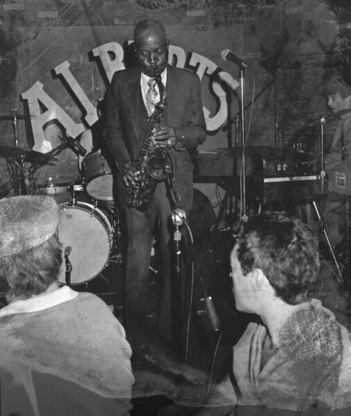
At the heart of Toronto’s Annex neighbourhood stood The Brunswick House. Founded in 1876, it was originally established as a hotel before becoming a tavern known as “Ye Olde Brunswick House” in 1920. By 1961, the building was purchased by Morris and Albert Nightingale who turned it into an English-style pub known affectionately as “The Brunny.” While presently remembered for the 1974 Brunswick Four incident—in which four lesbian women were arrested during an amateur performance night—the venue also stood as a hub for college-aged patrons, known for its loud music, cheap beer, and chaotic energy. Despite this, Albert Hall, nestled quietly on the second floor of The Brunny, fostered a more intimate experience, attracting local and international performers such as Gordon Lightfoot, Etta James, Oscar Peterson, Blossom Dearie, and Jeff Buckley. From the Collingwood Collection comes this striking picture of American jazz pianist, vocalist, and composer Jay McShann, standing mid-performance while playing the saxophone, thus solidifying Albert Hall as an important stop along the North American jazz circuit during its heyday.
2021.003.35.01.012, Jay McShann last jazz concert at Albert Hall, 1982
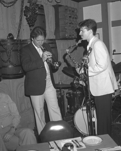
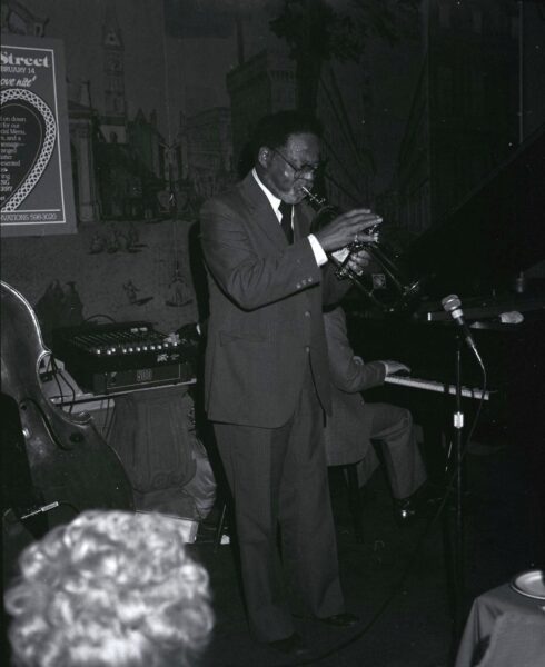
Offering a much different atmosphere than The Brunswick House, a club known as Bourbon Street, run by George’s Spaghetti House owner, Doug Cole, stood on Queen Street West in the early 1970s. Providing an upscale ambiance and refined experience, 180 Queen St. W, sharing a location with Basin Street and George’s Italian Café, was best known for hosting a variety of American mainstream and modern jazz talents including Jim Hall and Paul Desmond, who both recorded live albums in the venue. Collingwood captured two captivating Bourbon Street performances in the 1980s, the early 1980s; Swing duo Warren Vaché and Scott Hamilton are photographed in 1982 playing mere inches from diners, while bebop trumpeter Clark Terry is captured in 1984 in front of a valentine’s day “Love Nite” event poster.
2021.003.35.01.024, Scott Hamilton and Warren Vache at Bourbon St., 1982
2021.003.37.01.018, – Clark Terry at Bourbon St., 1984
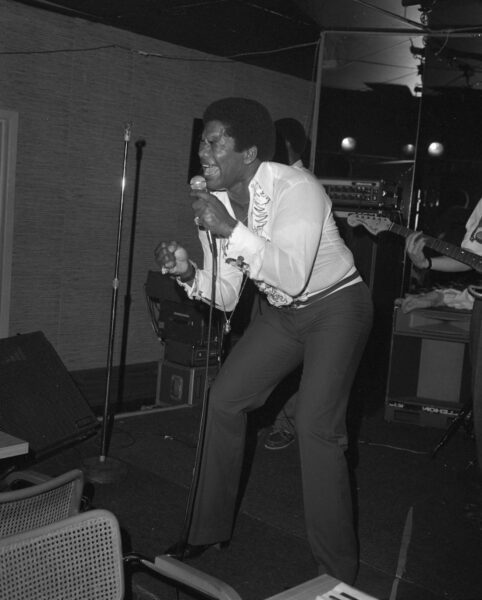
Of all the artists photographed in the Collingwood Collection, one figure stands out for his electrifying stage presence: The Mighty Pope. Born Earle Heedram in Lucea, Jamaica in 1948, he immigrated to Canada in 1965 and quickly became a “mighty” voice in Canadian soul and R&B. Photographed in an unknown venue in July 1982, fist clenched, expression intense, and dressed in a satin shirt, The Mighty Pope embodied charisma and vulnerability on stage, qualities that made him a late-twentieth century heartthrob and magnetic live performer. Over his career, he played at iconic venues like Le Coq d’Or and the Hawk’s Nest, offering a soulful touch to Toronto’s nightlife.
2021.003.35.01.008, Mighty Pope,1982
Decades may have passed since these clubs echoed with music and applause, but the Collingwood Collection preserves the spirit of Toronto’s live music scene through its impactful, kinetic images. These photographs remind us that fleeting performances leave behind lasting traces, allowing future generations to glimpse the faces, venues, and sounds that helped shape Toronto’s identity.
“George’s Jazz Room.” The Canadian Encyclopedia, February 7, 2006. https://www.thecanadianencyclopedia.ca/en/article/georges-jazz-room-emc.
Greenberg, Courtney. “From 1874 until Today, the Brunswick House Has Seen Many Faces.” Toronto Guardian, July 12, 2017. https://torontoguardian.com/2017/06/brunswick-house-rexall.
Marie, Denise. “George’s Spaghetti House – Canada’s Premier Live Jazz Club.” TorontoJourney416, September 2, 2024. https://www.torontojourney416.com/georges-spaghetti-house/.
“The Mighty Pope.” Canada Black Music Archives, October 7, 2024. https://thecbma.com/artists/the-mighty-pope/.
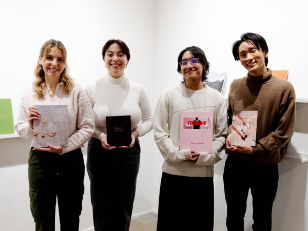
Award recipients and their books at the opening reception and awards celebration. Image courtesy of Artspace TMU gallery.
We are thrilled to announce the 2024 winners for the First Edition Photobook Award!
The TMU Libraries First Edition Photobook Award was instituted in 2015 by Special Collections Librarian Alison Skyrme and Image Arts Instructor Christopher Manson. As part of MPS507 – The Photographic Book, 3rd year Image Arts students conceive of, and produce photobooks during the course, based on their photography. The course concludes with a group show of the books at TMU Artspace gallery.
Each year, TMU Libraries purchases the First Edition Award winning books from the students, catalogues them, and houses them in Special Collections. The winning books are selected by a jury panel using design, sequencing, and integration of images and text as the main evaluation criteria.
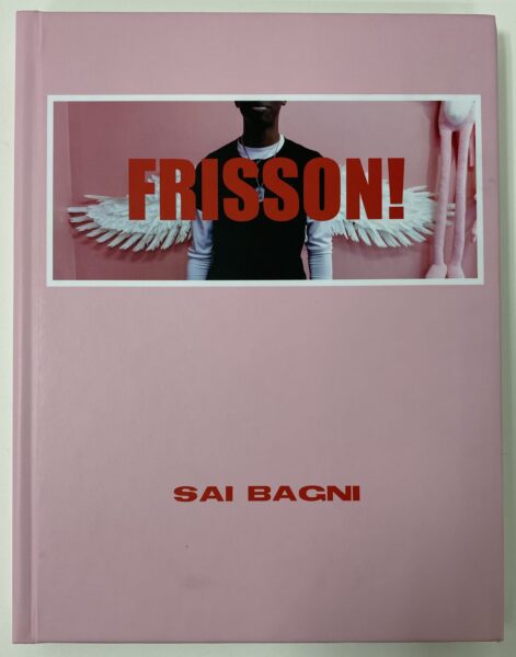
Sai Bagni, Frisson! A universe built from my observations of my online youth. It is a coming-of-age that exists in pixels and code. Frisson: a word of French origin that describes a feeling of fear or excitement that precedes the anticipation of something that’s about to happen. It denotes the act of waiting and anticipating for something that stands out amongst the banality of everyday life.
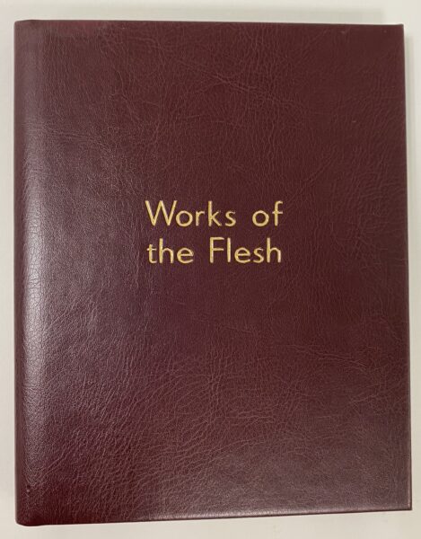
Madison Chow, Works of the Flesh.A collection of Polaroids and long exposure imagery that explores the body, created with the intention to speak to experiences of sexualization in the church. Paired with handwritten text, the images create a biblical narrative, using its symbolism to confront and heal from religious trauma.
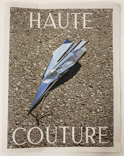
Max Grueninger, HAUTE COUTURE.By reimagining the purpose of each image and subtly weaving fashion elements into the narrative, the visuals aim to inspire a new generation to see the term haute couture as not merely clothing but as a dynamic, evolving concept that can transform and elevate the ordinary into the extraordinary.
Alejandra Harrison, Murder at Monochrome Manor.Inspired by the classic board game Clue and visual styling of film noir Murder at Monochrome Manor explores the limitations of photography in data collection and the power of individual understanding. Offering minimal context to enhance the interactive element, this work invites viewers to take on the role of investigator by examining the images for clues and piece the mystery together to find a solution they interpret.
Sophia Markelj, Generational Flavours. Explores the intimate connection between food, family traditions, and cultural heritage. Using passed-down dishware, tablecloths and cutlery, I explore a gift my grandmother gave me before she passed. Motivated by the notes she left me, these images become not merely representations of dishes, but visual tributes to the love and stories passed down through generations.
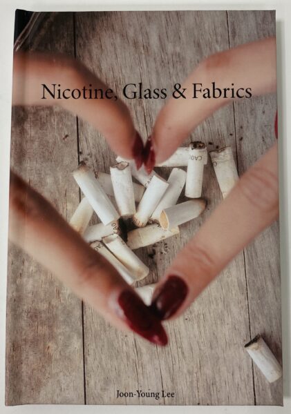
Joon-Young Lee, Nicotine, Glass & Fabrics. A photographic love letter to 3 friends who have been apart of my entire career as a photographer. The book recontextualizes each image to reflect on the memories and relationship built from them, paried with transcripts from my conversations with each friend.
Christie Xu, A Place On Earth.In the summer of 2023 my partner and I plotted out our longest cross-country flight after a failed attempt last winter break. “A Place On Earth“ documented our trip from Albany, New York to visit Purdue University in Lafayette, Indiana where he started his flight training, just in time for our friend’s graduation. After that, we head South to Huston, Texas before turning back to New York via Louisiana, Tennessee and Ohio. This book includes polaroids and 35mm film during flying.
2024 Jury Panel
This year we were fortunate to have a judges panel that included Kristen Adlhoch, Holly Forsythe Paul, Jennifer Park and Rahim Perez-Anderson.
Kristen Adlhoch holds a BFA in Photography from Toronto Metropolitan University, and an MLit and PhD in the History of Photography from the University of St Andrews, Scotland. She is currently a Part-Time Lecturer and the Student and Partner Outreach Coordinator for the Film and Photography Preservation and Collections Management MA program at TMU.
Holly Forsythe Paul is a rare book librarian who received her M.I. from the University of Toronto in 2021. Prior to her studies in librarianship, Holly taught English literature and writing at University of Toronto for over a decade. She is currently the Special Collections Librarian at TMU Libraries and teaches Conservation & Preservation of Recorded Information at the University of Toronto’s Faculty of Information.
Jennifer Park is the Art Preparator at The Image Centre at Toronto Metropolitan University. She is also a Co-Coordinator of the IMC’s Art Handing Apprenticeship Program which offers training to BIPOC who are in the early stages of their career in museum work.
Rahim Perez-Anderson is a Black visual storyteller, working out of Tkaronto/Toronto. Intrigued by human experience and the observation of life, Rahim specializes in self-portraiture and documentary photography, exploring his lived experiences within and around topics of identity, race, and selfhood.
Do you know the Yellow Nineties 2.0 database? It is an open-access resource dedicated to the study of eight late-Victorian “little magazines” produced between 1889 and 1905. The brief period is known as the “Yellow Nineties” after The Yellow Book, a controversial quarterly publication that embodied the “decadent” culture of the fin de siècle.
Toronto Metropolitan University professor Lorraine Janzen Kooistra spearheaded the Yellow Nineties 2.0 website, a digitization project that has evolved into a world-class online database composed of searchable editions of each publication, a database of textual ornaments found in the issues, peer-reviewed essays on the “little magazine” contributors and much more research on the period and the people who produced these works. The scholarly site is dedicated to the study of The Yellow Book, The Dial, The Pagan Review, The Evergreen, The Savoy, The Pageant, The Green Sheaf and The Venture. Many of the physical publications held at Toronto Metropolitan University Libraries Special Collections were digitized to create online versions for the database.
To celebrate the Yellow Nineties 2.0’s completion, TMU’s Special Collections is hosting an exhibition until the end of April 2024 showcasing the Victorian “little magazines” in our holdings.
Over the years, the “little magazines” held in Special Collections alongside the Yellow Nineties 2.0 database have facilitated interactive student workshops and research creation through TMU’s English department among other partnerships on campus. Explore the Y90s Classroom website to learn more about the research and exhibitions created using these collections.
Student have shared their initial reactions after being introduced to the Yellow Nineties 2.0 and the physical copies held at TMU Special Collections below:
What a treat to hold a piece of art and literary history in your hands! Interacting with the collection online and in person is like night and day – they complement each other. While the online collection is wonderful for facilitating remote research, these magazines truly are art objects and must be appreciated in their proper, corporeal form. Nothing can compare to the opportunity to interact with the item itself. It’s a tremendous privilege to reach into the past and touch the same pages that were lovingly designed, printed, and bound, by literature lovers of the past. While there are no time-machines at TMU, historical literary collections are the next best thing.
History preserved in time—a glimpse at the lives and creative pursuits of those who lived over a century before us.
It was very interesting to me that quite a large amount of the pages in some of the magazines were white, compared to present-day magazines which cover every single empty space with something. This really allows the reader to focus their attention on the sole thing that the page is presenting to them, whether it be a short story, a poem or a piece of art.
To view the current exhibition 1890s Little Magazines: Art for Art’s Sake in Print , visit us on the 4th floor of the TMU Libraries Building. The current exhibition, available until April 30th 2024, features several of the “Little Magazines” held at TMU Special Collections, including The Dial, The Yellow Book, The Evergreen, The Savoy, The Pageant and The Venture.
After the great success of the Kelmscott Press under the direction of William Morris (1834-1896), artists and bookmakers recognized that there was a niche audience willing to buy expensive books with daring or progressive subject matter as long as they were beautiful.
This change in the notion of the reading public, its taste and, particularly, its morality, liberated artists to make increasingly exotic books and periodicals. The ‘little magazines’ of the 1890s sprang up in this context. Beautifully designed and illustrated, they embody a different set of values from those we associate with Victorian orthodoxy: celebrating gendered, sexual, regional, or social alternatives.
Printing changed in the 1890s, starting with the Pre Raphaelite concept of total book design, and the Arts & Crafts return to artisanal craftsmanship. High-quality volumes could be sold for very high prices and no longer needed a mass audience in order to become financially viable productions. First-rate artists were drawn from the canvas to the page as technological developments gave them more control and the development of a niche, connoisseur audience gave them more thematic flexibility. The “Little Magazines” of the 1890s are among the most prized results: an outburst of sophisticated, beautiful publications by the most talented, avant-garde artists of the Aesthetic Movement.
The current exhibition, available until April 30th 2024, features several of the “Little Magazines” held at TMU Special Collections, including The Dial, The Yellow Book, The Evergreen, The Savoy, The Pageant and The Venture.
The Dial: An Occasional Publication (5 issues, 1889-1897)
Produced by joint editors Charles Ricketts (1866-1931) and Charles Shannon, The Dial featured art and literature, much of it produced by a core bohemian circle who congregated at Ricketts and Shannon’s home. Unlike most Art Nouveau magazines, The Dial prominently features wood engraving and lithography, illustrative techniques in which the artist controls the means of production. Although only five issues were produced by a small group of artists for a niche audience. the artisanal integrity and harmonious design of The Dial had a major impact, influencing a revival in wood engraving and leading to Ricketts’s founding of The Vale Press (1896-1904).
The Yellow Book: An Illustrated Quarterly (13 issues, 1894-1897)
The Yellow Book embodies the “decadent” culture of the fin de siècle. Aubrey Beardsley (1872-1898) proposed a quarterly that would focus equally on art and literature to the publisher John Lane (1854-1925) with Beardsley as art editor & principal artist while Henry Harland (1861-1905) acted as literary editor. Taking the colour yellow as a nod to risqué Continental literature and producing grotesque and suggestive images designed to shock the uninitiated, Beardsley courted controversy and found it. Fearful of Beardsley’s association with Oscar Wilde (1854-1900) when the latter was arrested for “gross indecency,” Lane fired Beardsley. The change from daring to conservative content that starts with the fifth issue highlights Beardsley’s impact on the early volumes.
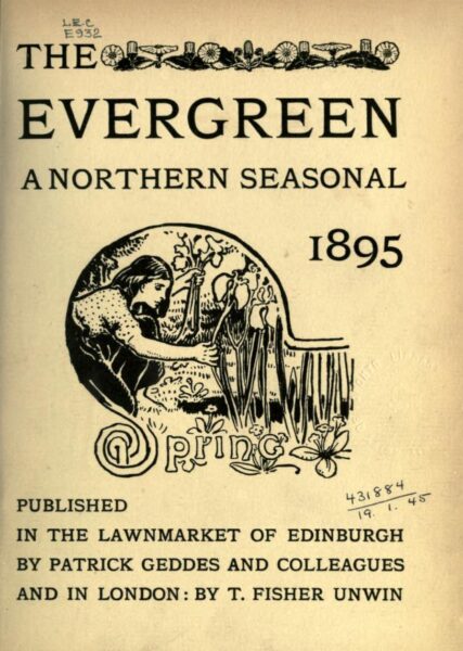
The Evergreen (4 issues, 1895-1896/7)
Reflecting the diverse concerns of its polymath sponsor, Patrick Geddes (1854-1932), The Evergreen blends interests in ecology and urban renewal with a celebration of the Scottish Renascence and the Celtic revival.
These conservationist & post-colonial priorities are manifest in the periodical’s appearance, particularly its type. The Evergreen was printed by Edinburgh’s foremost arts-and-crafts printer, Walter Blaikie (1848-1928), and deliberately revives Celtic art in its ornaments. Copies bearing the coloured leather bindings designed by Charles Mackie (1862-1920), with a stylized tree on the upper cover, are especially prized.
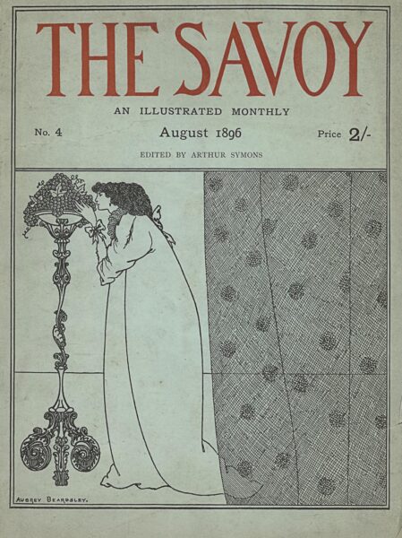
The Savoy (8 volumes, 1896)
When Aubrey Beardsley was fired from his role editing The Yellow Book, Leonard Smithers (1861-1907) seized the opportunity to enlist the talented artist. Like The Yellow Book, The Savoy combined art and literature, and adopted the format of the book, with stiff board covers, high-quality paper, and fine illustrations. In its pages, we can trace Beardsley’s departure from the influence of Japanese woodcuts to the rococo style of 18th-century France, with much more fine detail and texture. After two quarterly issues, Smithers retooled The Savoy as a monthly magazine, changing its format, streamlining the contents, and lowering the price. Although it ultimately failed to find an audience, it is a remarkable attempt to extend avant-garde art to a wider public.
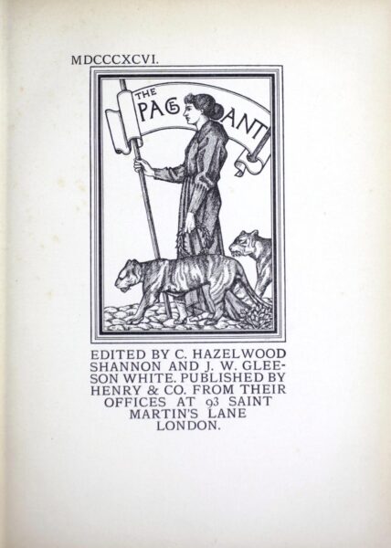
The Pageant (2 volumes, 1896 & 1897)
Edited by Charles Shannon (1863-1937) and Gleeson White (1851-1898), The Pageant connects the little magazines to the earlier genre of the Christmas Annual. Like the Ladies’ Annuals that had been a dominant genre in the book market in the 1830s, The Pageant offered reproductions of famous works of art in print. Unlike its predecessors, this avant-garde journal had a distinctly sophisticated & intellectual array of content, including art history, ancient myth, modern western culture, and decadent cosmopolitanism. In this respect, The Pageant connected the Aesthetic movement to a long tradition of European art.
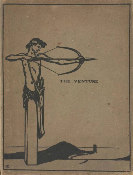
The Venture: An Annual of Art and Literature (2 issues, 1903-1905)
The Venture was published by gallery owner John Baillie (1868-1926) and edited by Laurence Housman (1865-1959) and W. Somerset Maugham (1874-1965). Determined to make The Venture into a “book beautiful”, Baillie enlisted James J. Guthrie (1874-1952) to print the letterpress and wood engravings of the first volume and Bernard Newdigate (1869-1944) to print the letterpress for volume two in collaboration with specialists in etchings, line blocks, lithographs, and photogravures. The Venture is beautiful and notable for its high literary quality, but failed to find a large audience. As its title indicates, producing a high-brow annual was always imagined as a risk.
Joseph Paul Christie September 17, 1937 – October 4, 2021
We can trace the origins of theatre programmes to the publicly-posted British playbills of the seventeenth century, which then evolvedto personal souvenir printings in the late-nineteenth century. We defer to the Canadian spelling, although you might see the interchangeable American “programs,” or defaults to the brand name “Playbill,” but they all refer to the same tradition. These personal reference items are sometimes sold as lavish souvenirs but are most often given freely to theatre patrons as they take their seats, and can have multiple functions. Most practically, they are a guide to the on- and off-stage artists involved with that night’s entertainment, and might include notes from the director or guidance on casting changes. They are souvenirs, to be filed away or consulted, to be autographed or even framed. Toronto Star theatre critic Karen Fricker noted in an April 2023 article that these “bridges between the spectator and the theatrical experience” can even double as a diary of sorts. They are evidence of attendance, something to spark memory and reminiscence over the joy theatre can bring. Programmes can be as simple as a single photocopied sheet; they can be glossy, high-quality publications. Some feature photos, some barely feature the names of the artists. Some are as thick as a novella, some are no bigger than a napkin, while some are printed as an entire newspaper. For many, the physical programme is intrinsic to the theatre-going experience, and despite recent moves to replace physical programmes with digital, smartphone-centred equivalents, collectors cling tight to their physical mementoes.
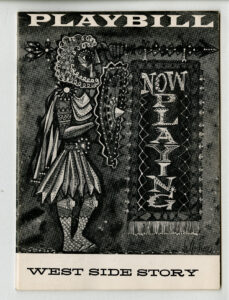
2021.12.06.22: Paul saw the Broadway premiere of West Side Story at the Winter Garden Theatre on October 14th, 1957.
On October 21, 2021, Joseph Paul Christie—Paul to his many friends—passed away peacefully at home. Paul lived a long and joyous life, from his youth in Toronto to adventures in London as a bookseller and a distinguished career as a court reporter with the Ministry of the Ontario Attorney General, but one of his many defining traits was his love of the arts. For the last thirty years of his life, Paul served as a front of house team member (to over-simplify, we might say ‘usher’) at theatres around Toronto, most notably the Elgin and Winter Garden Theatres. From this insider’s position, Paul saw as much theatre as he could. His theatregoing career stretched back to boyhood, and lasted until he literally could not see any more plays, as the COVID-19 pandemic closed theatres in the spring of 2020. After Paul’s passing, the Toronto Metropolitan University Archives and Special Collections were honoured to receive a gift commemorating a life in the theatre. In dozens of carefully curated binders, we were presented every programme (and ticket stub, and clipping, and souvenir postcard) that Paul Christie collected over the course of sixty-eight years, filed chronologically and with extensive annotation to create the Paul Christie Theatre Program Collection reflecting a lifetime in the arts.
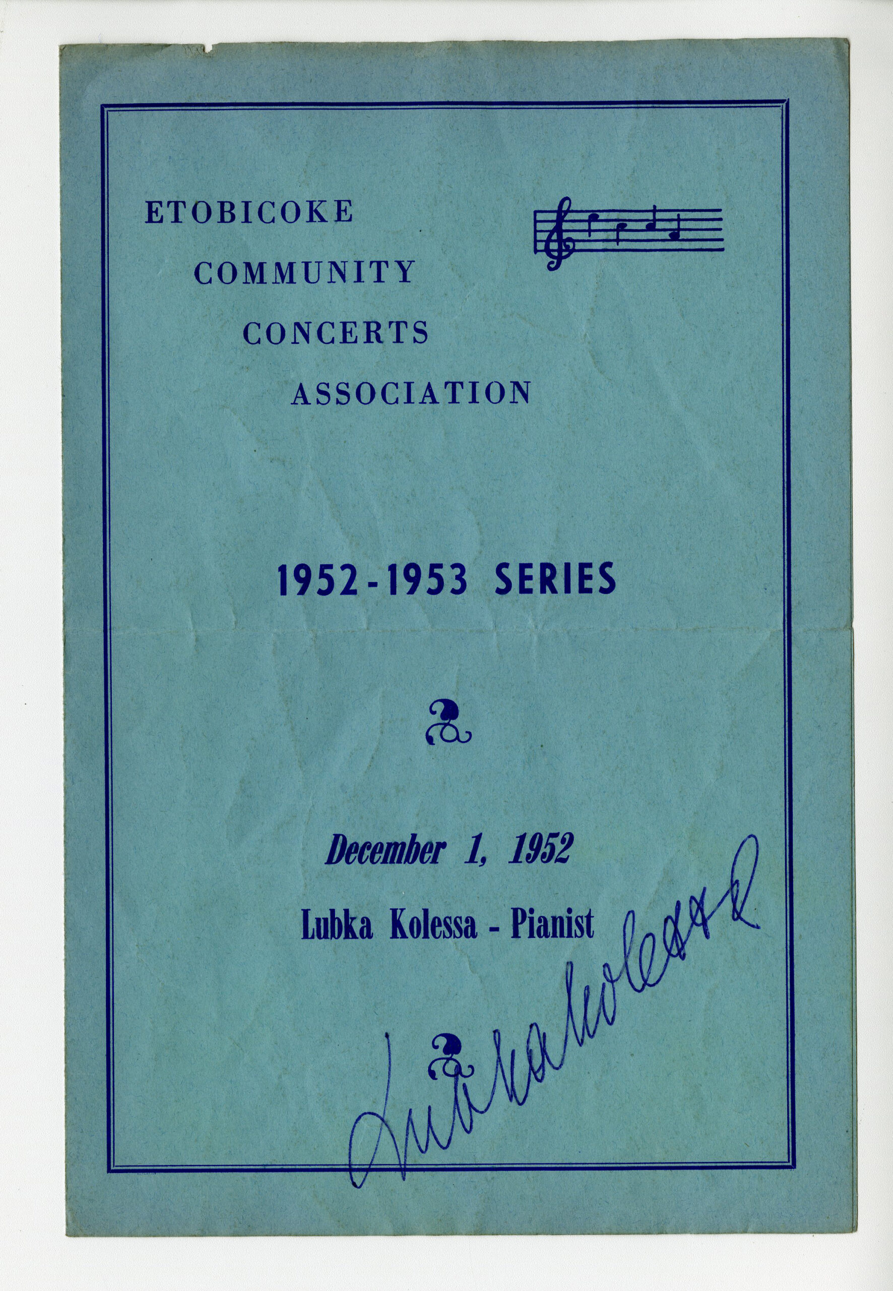
2021.12.01.01 – The very first Item in Paul’s collection: a program for the Etobicoke Community Concerts Association 1952-53 series presentation of Pianist Lubka Kolessa, signed by the artist, and attended by a 15 year old Paul.
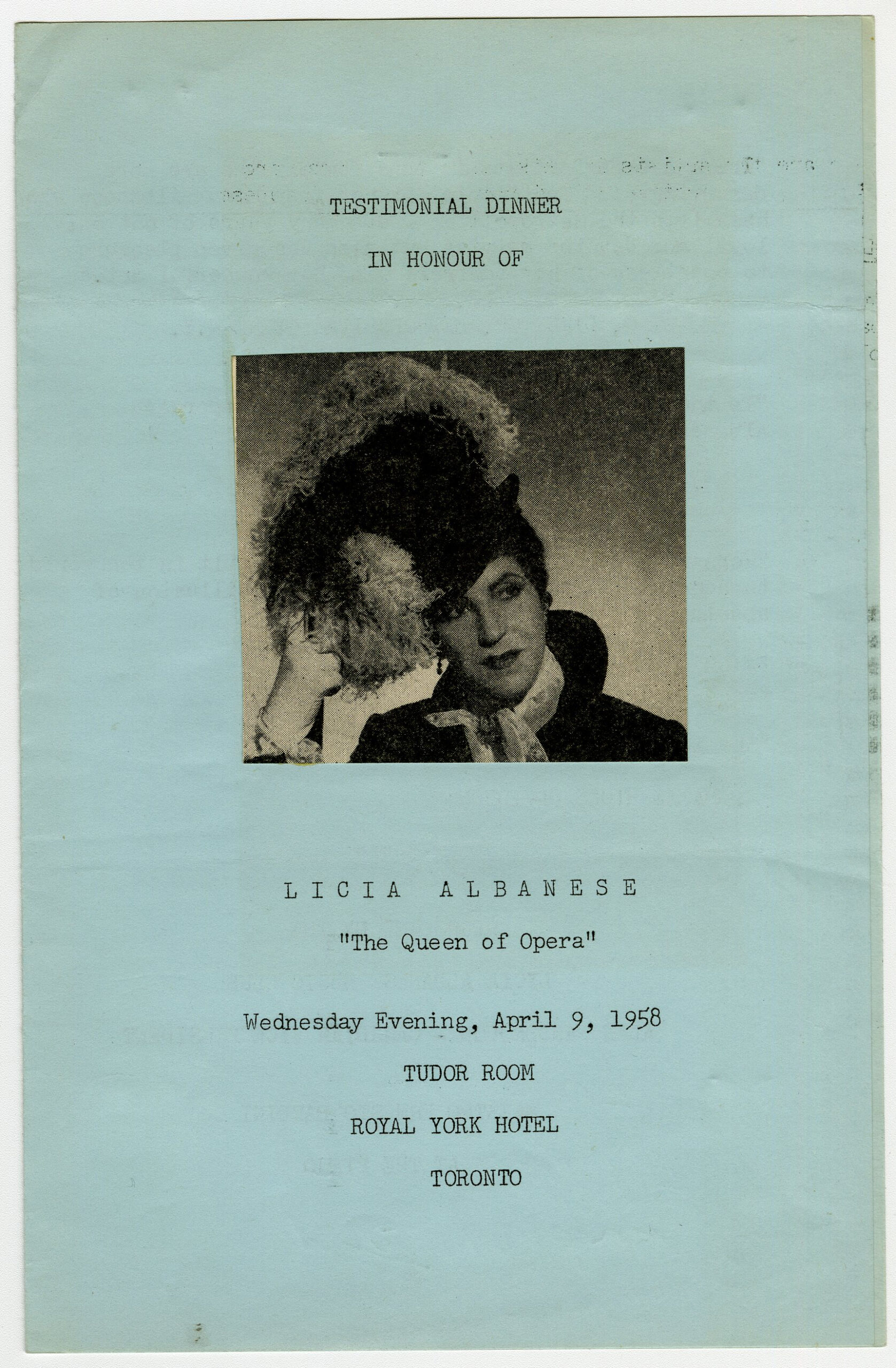
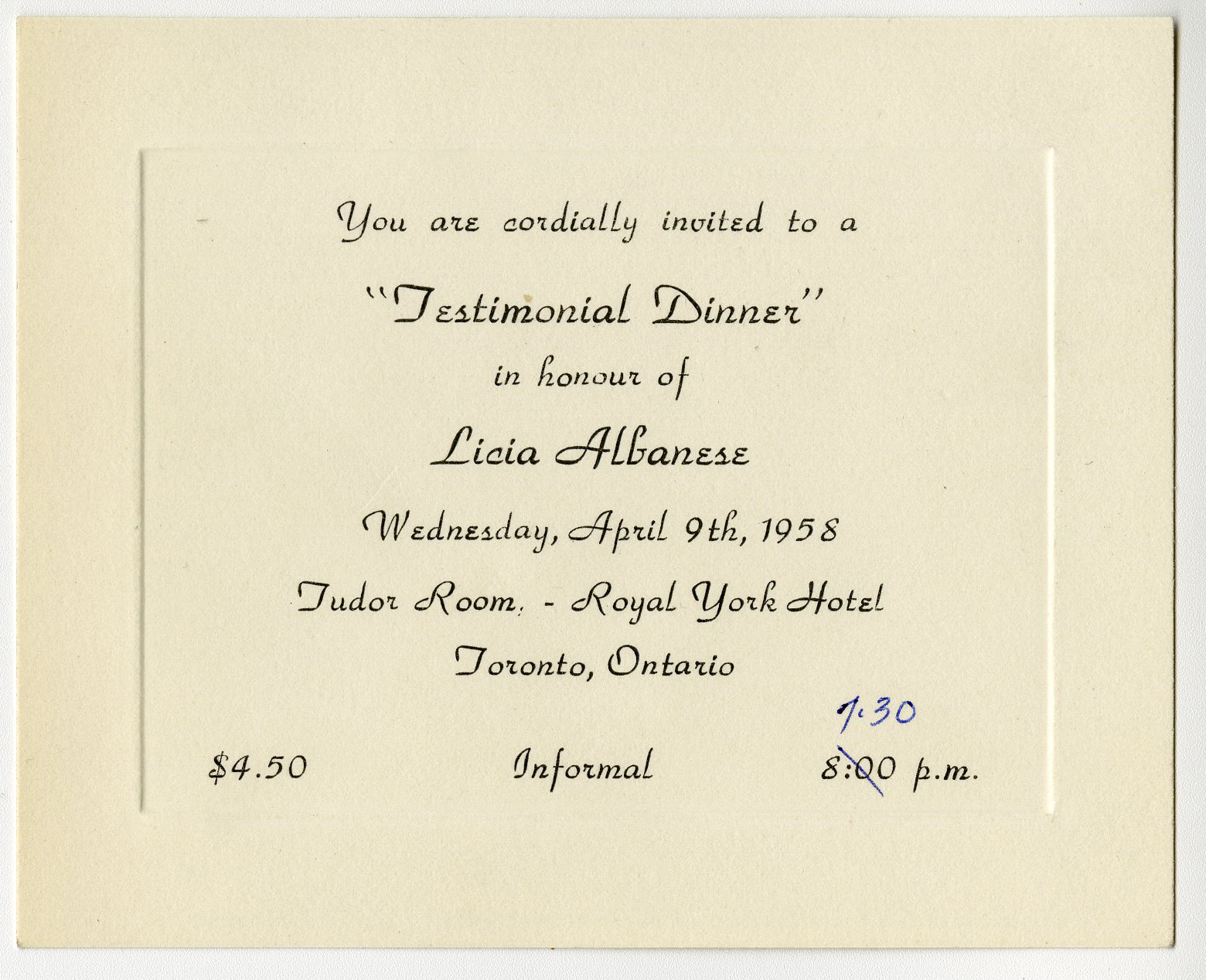
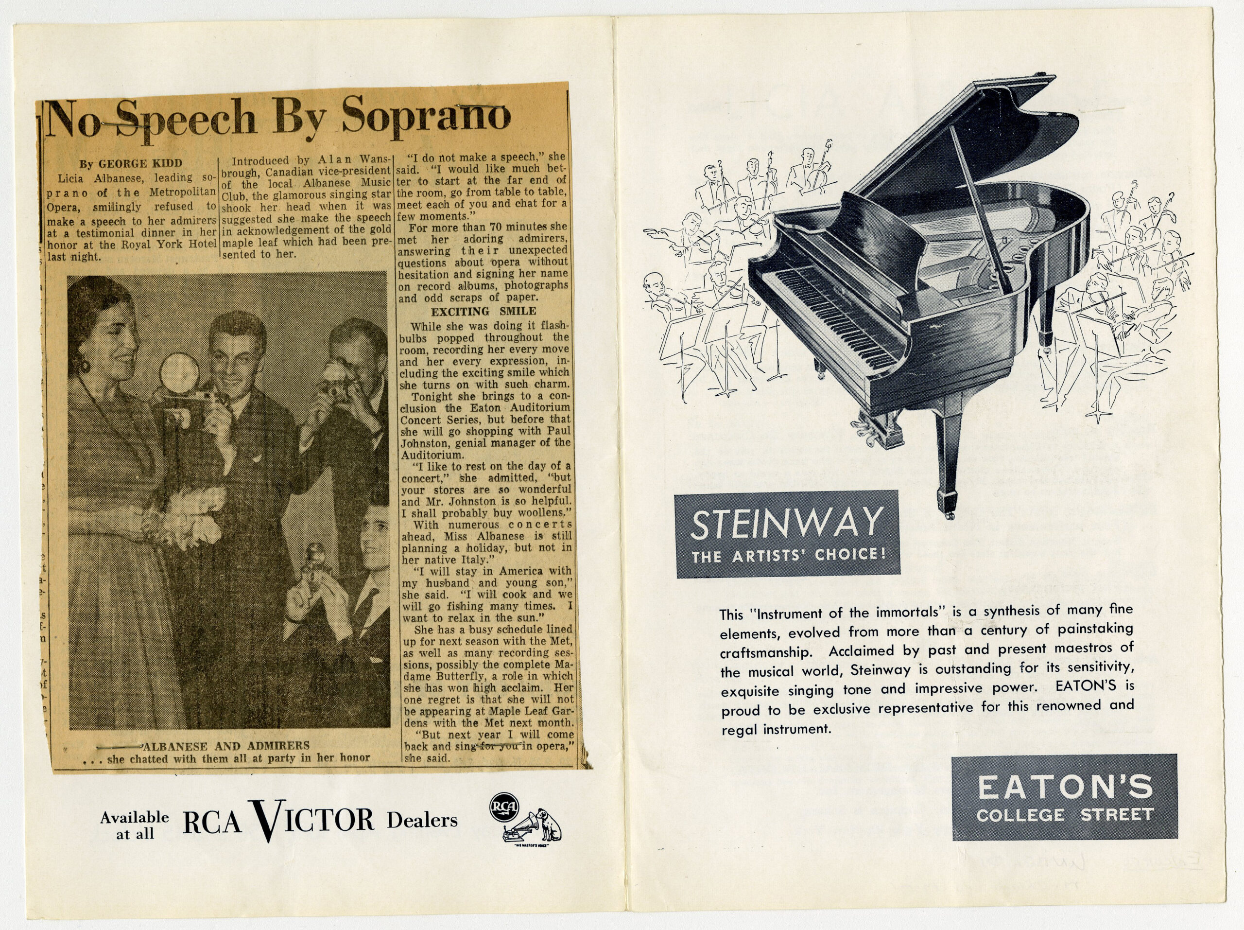
2021.12.07.11 – Some of Paul’s early fandom: a program for a testimonial dinner for singer Licia Albanese, held at the Royal York Hotel on April 9, 1958.
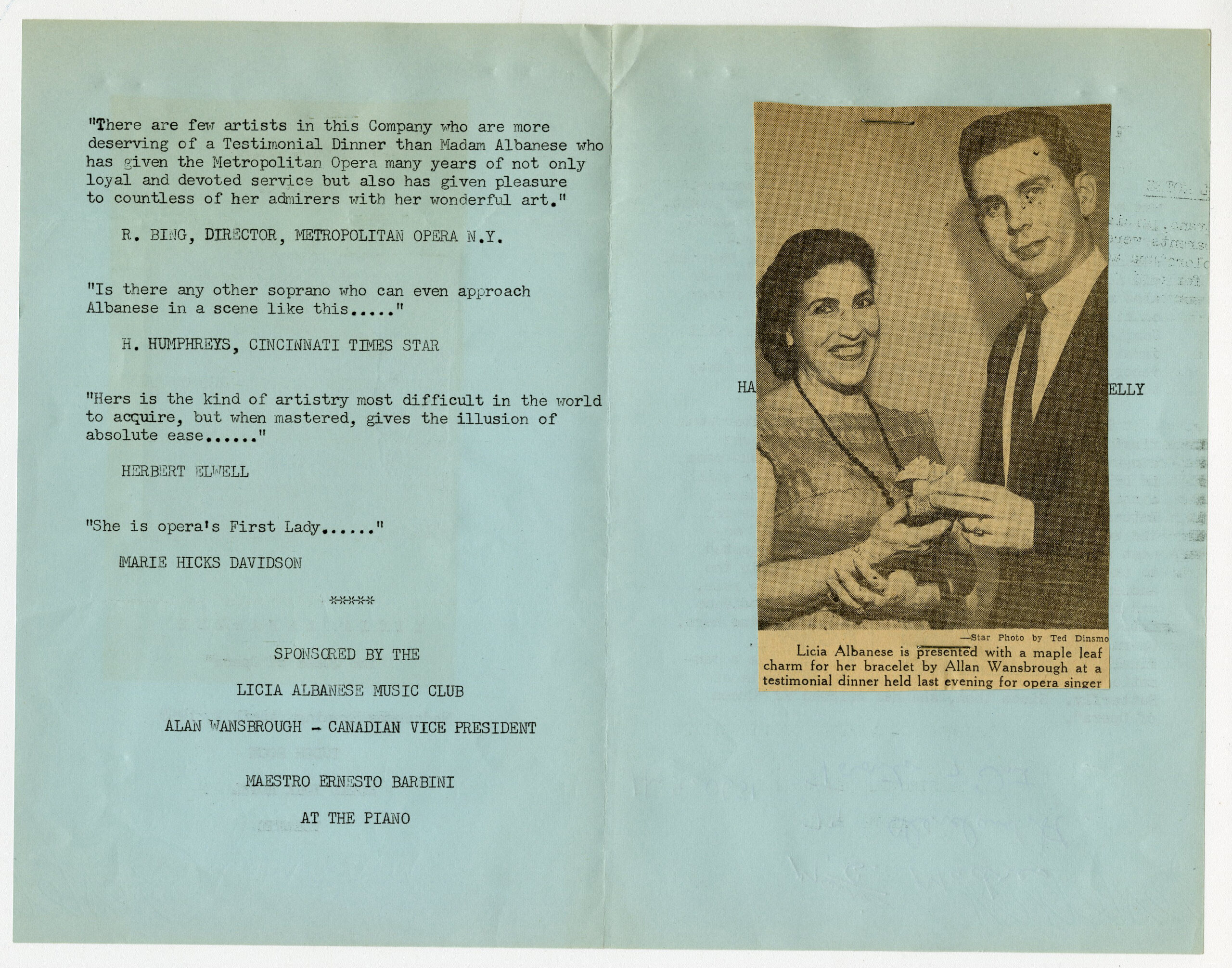
2021.12.07.121 – the program (and clipping) for a testimonial dinner for singer Licia Albanese, held at the Royal York Hotel on April 9, 1958.
2021.12.07.11 – Paul’s invitation to a testimonial dinner for singer Licia Albanese, held at the Royal York Hotel on April 9, 1958.
2021.12.07.11 – A newspaper clipping related to the testimonial dinner the night before.
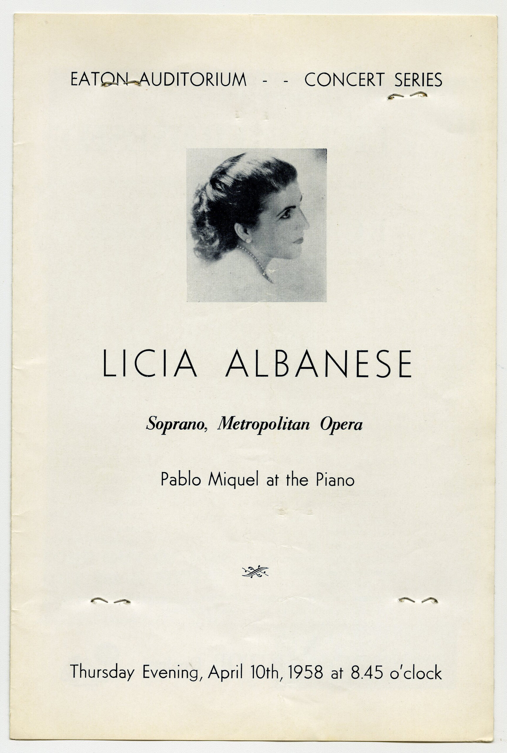
2021.12.07.12 – A program for a performance by Licia Albanese, held at the Eaton Auditorium on April 10, 1958.
As a former theatre professional and current contract member of the TMU libraries team, I was thrilled to have the opportunity to help with the description and cataloguing of the Paul Christie collection. This collection stretches from the sporadic souvenirs of a teenage boy, starting with an autographed 1952 programme for a piano concert by Lubka Kolessa at Etobicoke Community Concerts Association, one of two items that year. From these humble beginnings, it is clear Paul “caught the bug,” a theatregoing habit which peaked in 2012, in which he attended one hundred and fifty six performances, at a rate of three per week. A lover of opera, orchestral performance, theatre, and dance, Paul’s tastes were eclectic and adventurous.
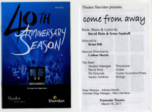
2021.12.62.27 – A program for the original production of the soon-to-be-classic Canadian musical Come From Away by David Hein and Irene Sankoff, presented by Theatre Sheridan at the Panasonic Theatre on March 18, 2013.
His collection spans the rise and fall of many of Toronto’s most legendary theatres, including the Crest Theatre, Theatre in the Dell, Centre Stage, and Melody Fair. He attended the first ever production at the O’Keefe Centre—Camelot featuring Julie Andrews and Richard Burton in 1960—and remained a patron of that venue as it evolved from the Hummingbird Centre to the Sony Centre to Meridian Hall. Paul’s theatregoing spanned the birth of Theatre Passe Muraille, the Factory Theatre, Soulpepper, and Buddies in Bad Times. He was a champion of the Toronto Fringe, and often attended a dozen shows in a single week to support new and emerging artists, evidenced by the intricate and specific notes he jotted in the margins. Paul was there when TIFF was still called the Festival of Festivals. He had his finger on the pulse of the next big thing: he saw world premieres of Hosannaat Tarragon, Kim’s Convenience at the Fringe and Come From Away at Sheridan College, all destined to become Canadian classics.
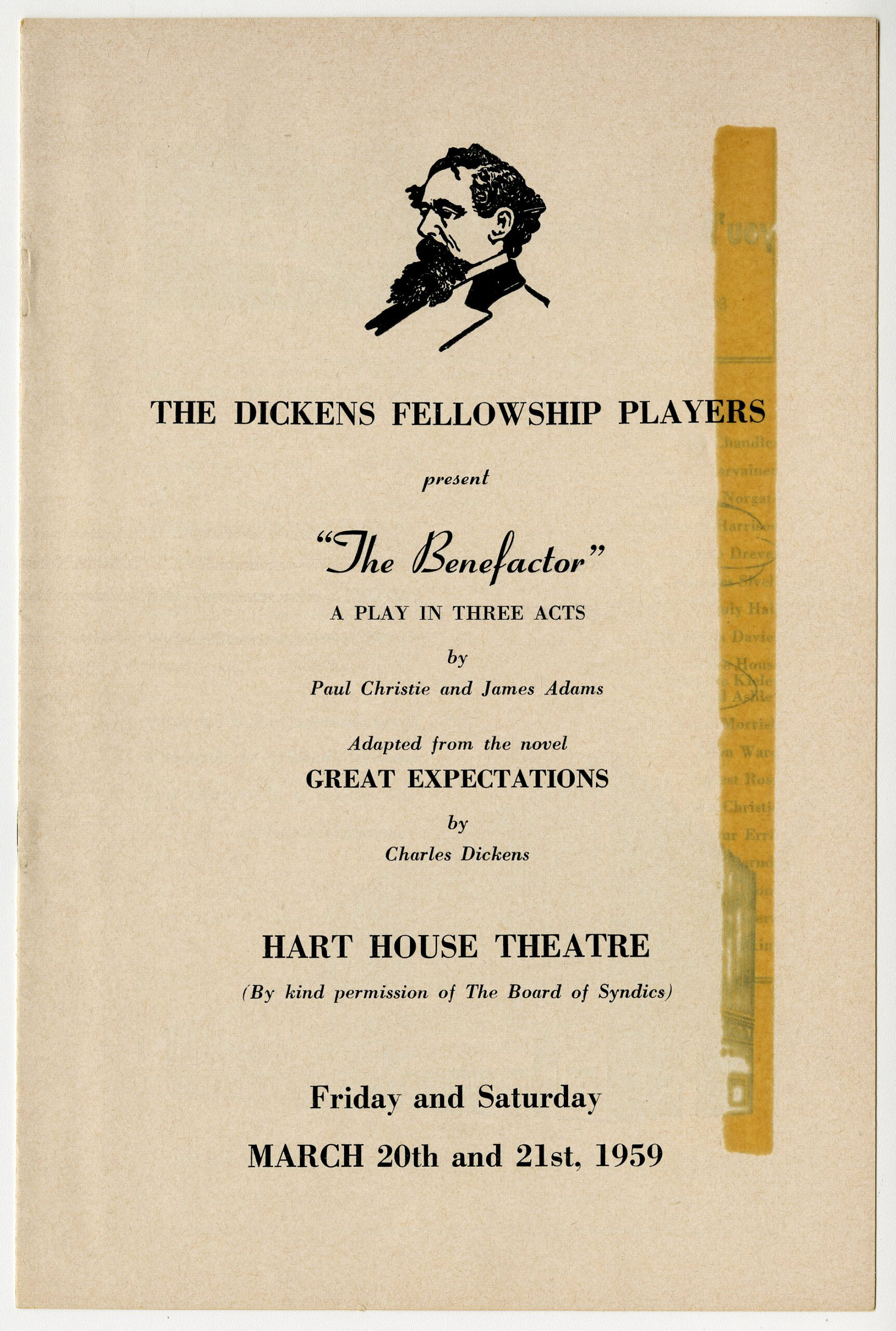
Paul briefly dabbled in the theatre himself, and several of his souvenir programmes note his involvement as playwright and actor with the Dickens Fellowship of Toronto. He played Herbert Pocket in his own adaptation of Great Expectations entitled The Benefactor, and later took on A Midsummer Night’s Dream’sBottom in the Shakespeare Society of Toronto’s 1960Twelfth Night Revels cabaret. While it was clear that the theatre was a crucial element in Paul’s life, he eventually left the stage to the professionals, and settled into his greatest role: audience member.
2021.12.08.05 – Programme for a play called The Benefactor, presented by the Dickens Fellowship of Toronto at Hart House Theatre, on March 19-20, 1959.
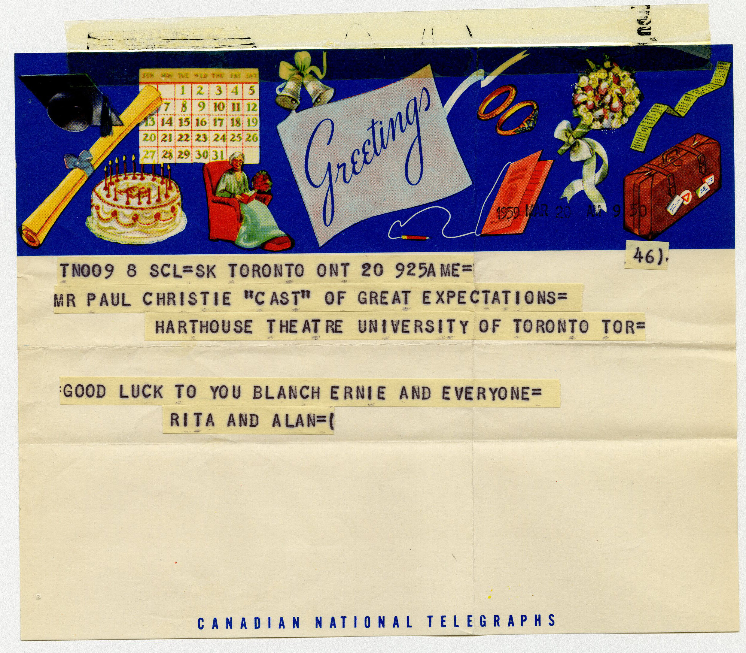
2021.12.08.05 – A telegram for cast member and playwright Paul Christie, wishing him luck on The Benefactor.
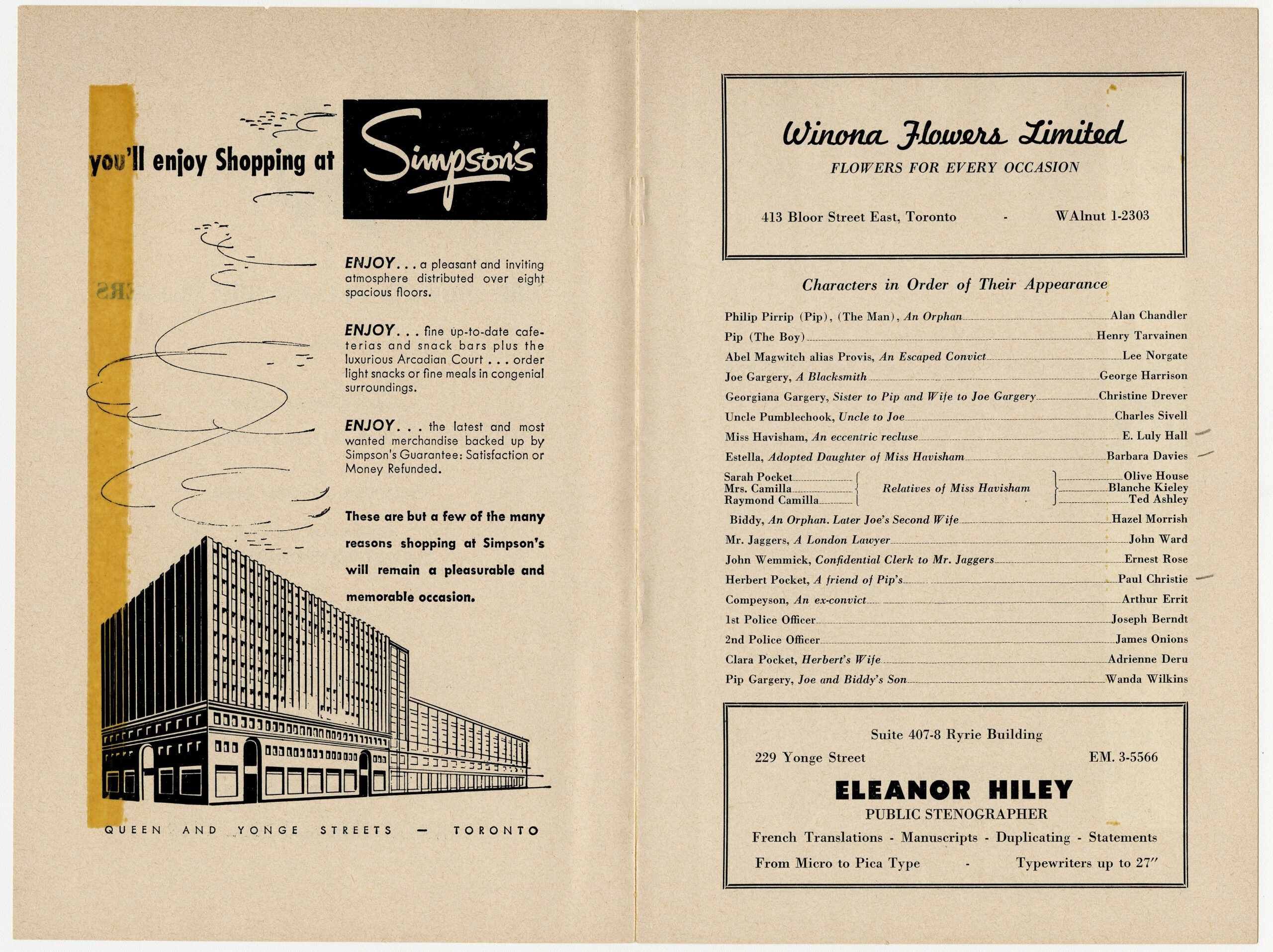
2021.12.08.05 – Inside of the programme for The Benefactor, including Paul Christie as Herbert Pocket.
Paul was a globetrotting theatregoer, with almost annual trips to New York City to enjoy what Broadway had to offer. He saw the original production of West Side Story three times (and kept three programmes as proof), saw Barbra Streisand’s breakout role in Funny Girl, and was there for the rise of the megamusicals in the 1980’s (Cats, Phantom, and Les Mis were regular repeat watches). Paul’s time in London afforded him opportunities to soak up British theatre, which included works at the Royal Shakespeare Company, Theatre Royal Covent Garden, and the Royal Opera. He also took advantage of the proximity to the continent, taking in opera in Germany and Moliere in Paris. He travelled regularly around Canada, with theatre programmes marking stops in Vancouver, Charlottetown, Halifax, and, most often, Stratford and Niagara-on-the-Lake. The Shaw and Stratford Festivals held a place of great joy in Paul’s artistic pursuits, and he was a loyal patron for nearly seven decades.
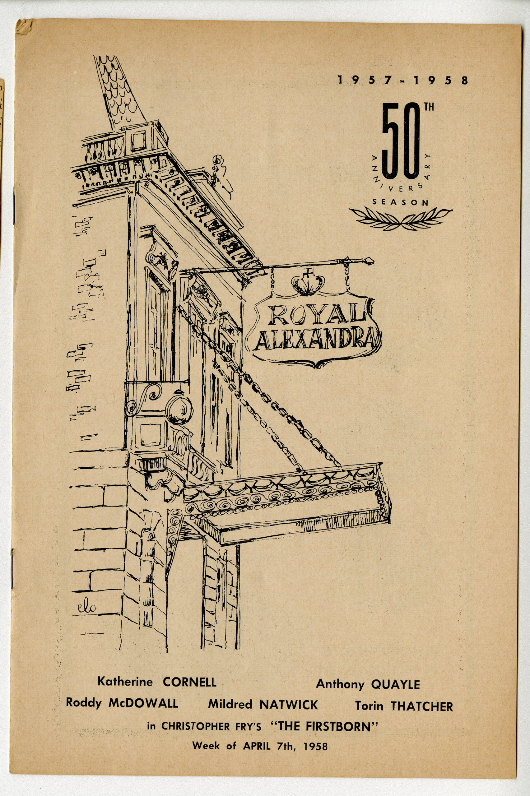
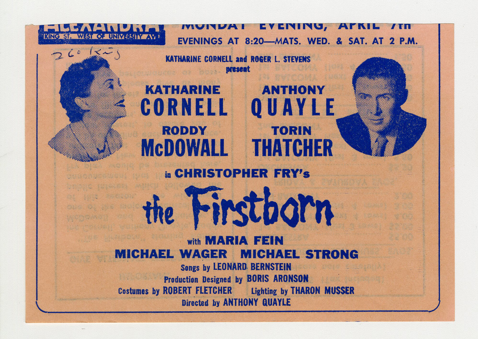
2021.12.07.10 – Paul was a great patron of the Royal Alex: this is a program for a play called The Firstborn by Christopher Fry, performed at the Royal Alexandra Theatre the week of April 7, 1958.
2021.12.07.10 – advertising material for The Firstborn by Christopher Fry, performed at the Royal Alexandra Theatre the week of April 7, 1958.
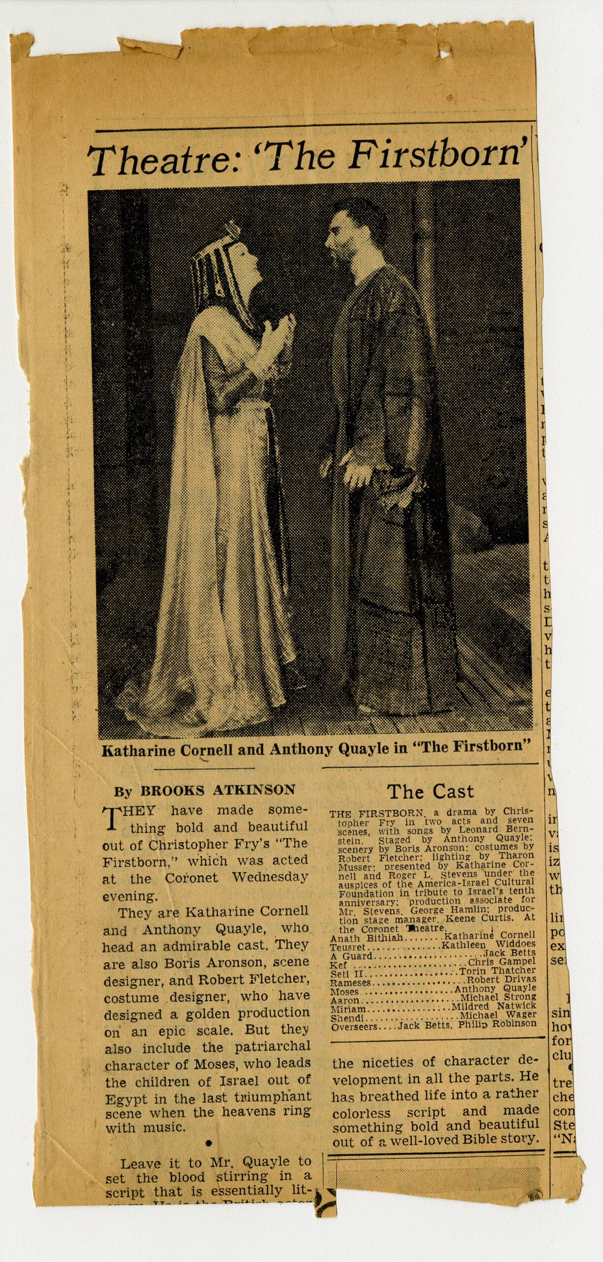
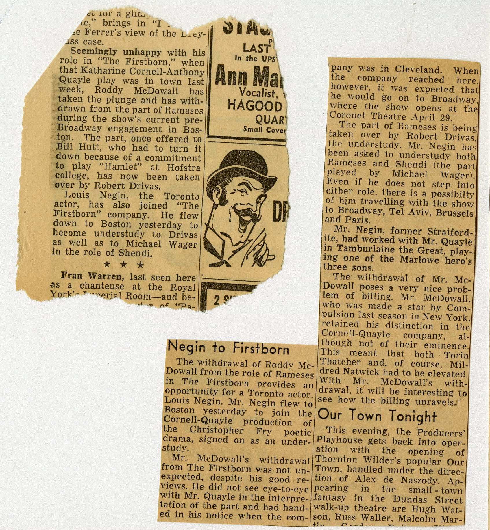
2021.12.07.10 – Paul was also an avid newspaper clipper, and would save reviews, advertisements, and articles about each production.
2021.12.07.10 – Paul was also an avid newspaper clipper, and would save reviews, advertisements, and articles about each production.
2021.12.07.10 – Paul was also an avid newspaper clipper, and would save reviews, advertisements, and articles about each production.
The remarkable thing about the Paul Christie Theatre Programme collection lies not in the rarity of the items or the fame of its collector. Rather, it is a snapshot of a part of one man’s life that brought such great joy, in attending performances across an extraordinary range of genres. To read through the collection of more than four thousand theatre items is to get to know Paul. As an Elgin and Winter Garden employee, he witnessed many hundreds of performances of all types at both theatres, from touring musicals to high school rentals to the Dora Mavor Moore Awards. He attended Christmas Eve services each year at Roy Thomson Hall with the Metropolitan Community Church of Toronto, and carefully filed those programmes alongside the theatre ones. He was a proud ally of Toronto’s 2SLGBTQ+ community, and was an avid supporter of queer-themed plays, cabarets, and fundraisers, especially through the dark days of the 1980s AIDS epidemic and beyond. In this, it was clear just how much Paul valued community and the power of the arts. Paul loved to rub shoulders with celebrities, and sought autographs from his favourite performers (including Maureen Stapleton, Gwen Verdon, Martin Short, and Paul’s favourite, Grant Tilly), who often left him with autographs which made clear how much his support was appreciated.
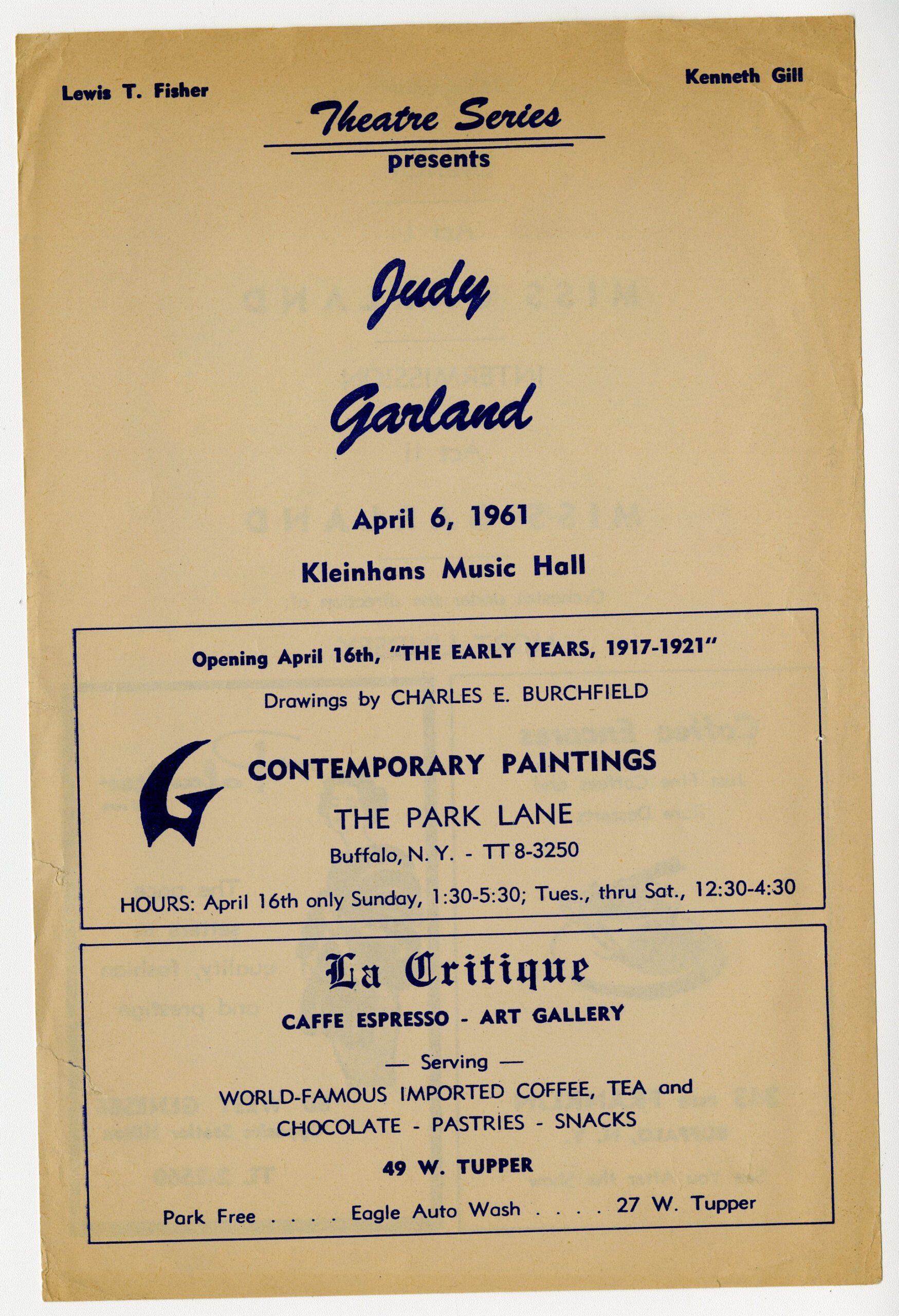
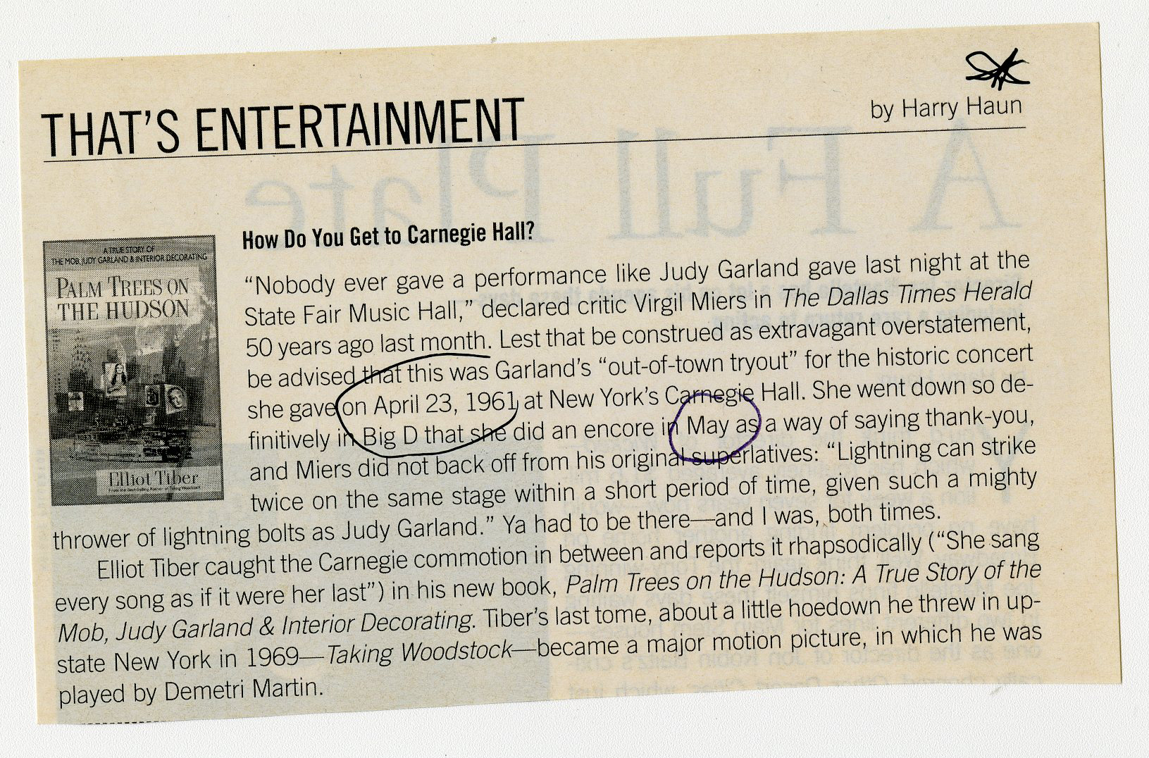
2021.12.10.05 – A programme for a concert featuring Judy Garland at the Kleinhans Music Hall, Buffalo (NY) on April 6, 1961.
2021.12.10.05 – Paul clipped an anniversary magazine article fifty years after this event, and included it with his original programme.
2021.12.10.05
– a clipping from the concert featuring Judy Garland at the Kleinhans Music Hall, Buffalo (NY) on April 6, 1961.
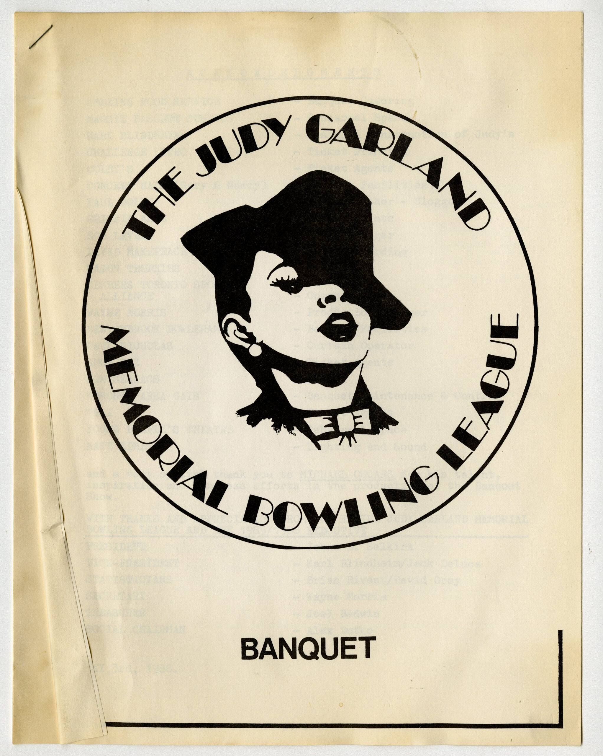
2021.12.35.20 – It wasn’t just theatre: a program for an event called the Judy Garland Memorial Bowling League, which was held on May 3, 1986.
Most incredibly, Paul used his theatre programme collection as a journal of sorts: each item is a treasure trove of annotations, opinions (where he would note his favourites in each show, and occasionally even those he did not care for), and clippings. From the earliest days in the collection, Paul collected newspaper articles and advertisements for the plays he had seen, and built intricate scrapbook pages to memorialise each performance. Sometimes he even returned to past entries to claim an autograph on a long-ago object or to supplement with new details. For the shows that did not offer a programme, Paul would make his own, on a napkin, or the back of an envelope.
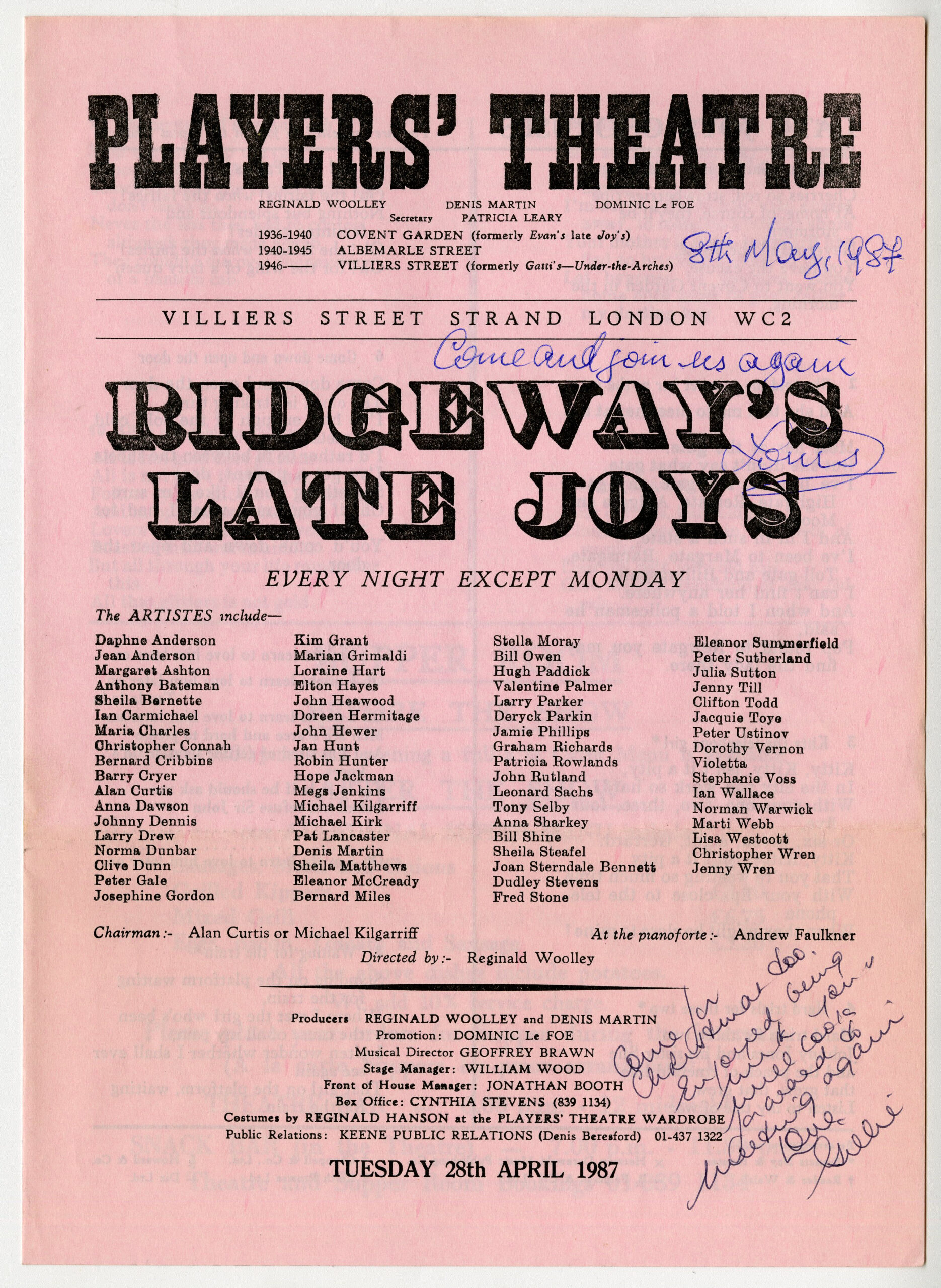
2021.12.36.12 – A program for a cabaret performance called Ridgeway’s Late Joys at the Players’ Theatre Club in London. Handwritten notes reflect this was attended on 8 May, 1987, and the programme has been signed by several performers.
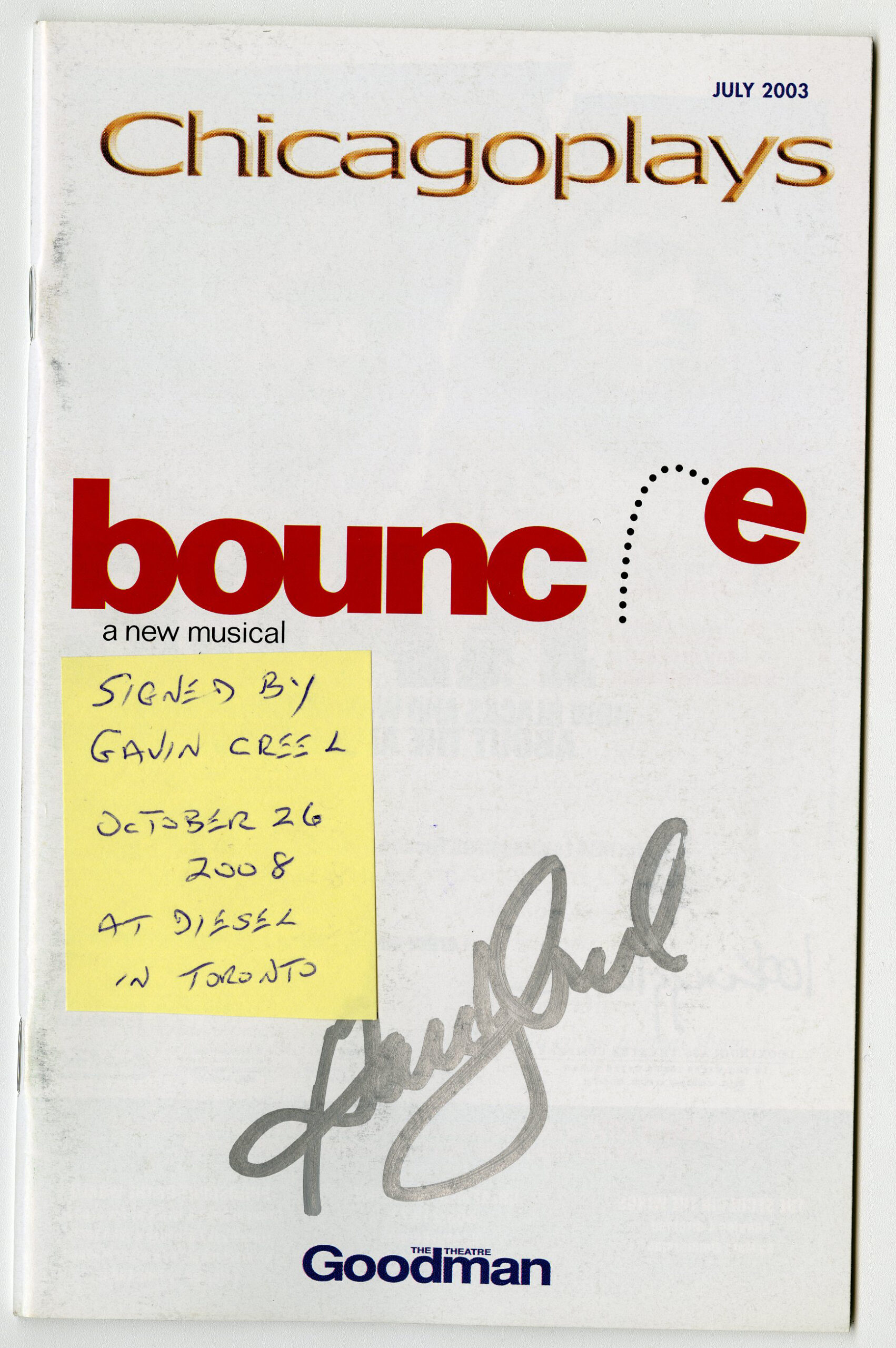
2021.12.52.64 – Paul showed how he used his collection for souvenirs: he attended Sondheim’s “Bounce” (later renamed “Road Show”) in Chicago at the Goodman Theatre, in July 2003 but five years later retrieved his programme at Diesel in Toronto to get an autograph from actor Gavin Creel.
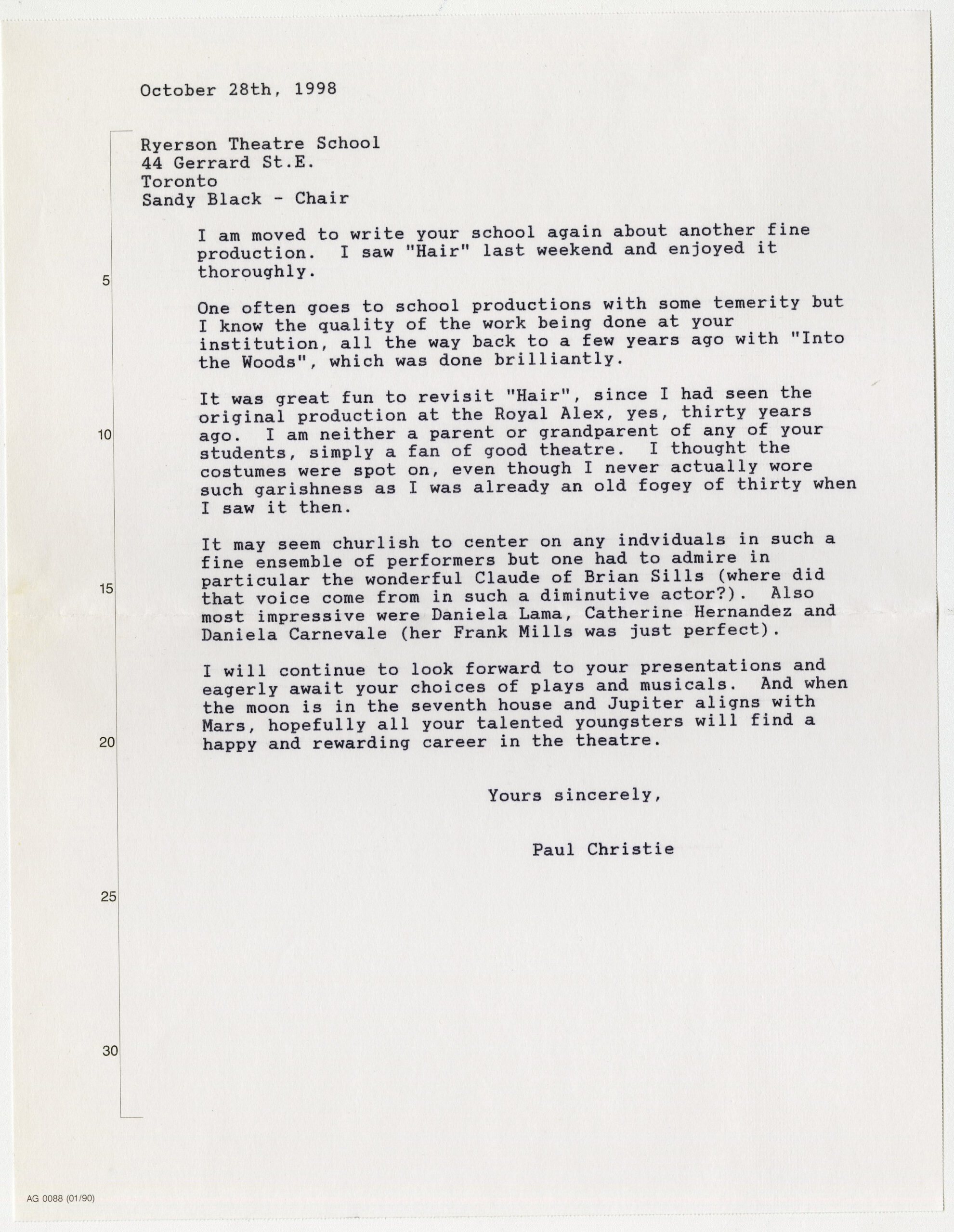
2021.12.47.58 – Paul would often reach out to artists: he attended Ryerson Theatre School production of Hair on October 24, 1998 and wrote a long letter to the chair of Ryerson Theatre School, with opinions on the production.
In his latter years, Paul’s collecting intensified, and it is clear that live performance was an overriding preoccupation, particularly with the advent of cheap, convenient screenings of live opera, ballet and theatre in movie theatres. Even these movie ticket stubs, for events which usually do not provide a programme, were carefully annotated. Often, Paul would attend up to three or four films a week to see performances from the Metropolitan Opera, National Theatre of Great Britain, and Stratford Festival. Later entries even included developed photographs of the marquees and posters outside of theatres and cinemas, carefully placed to preserve a moment in time.
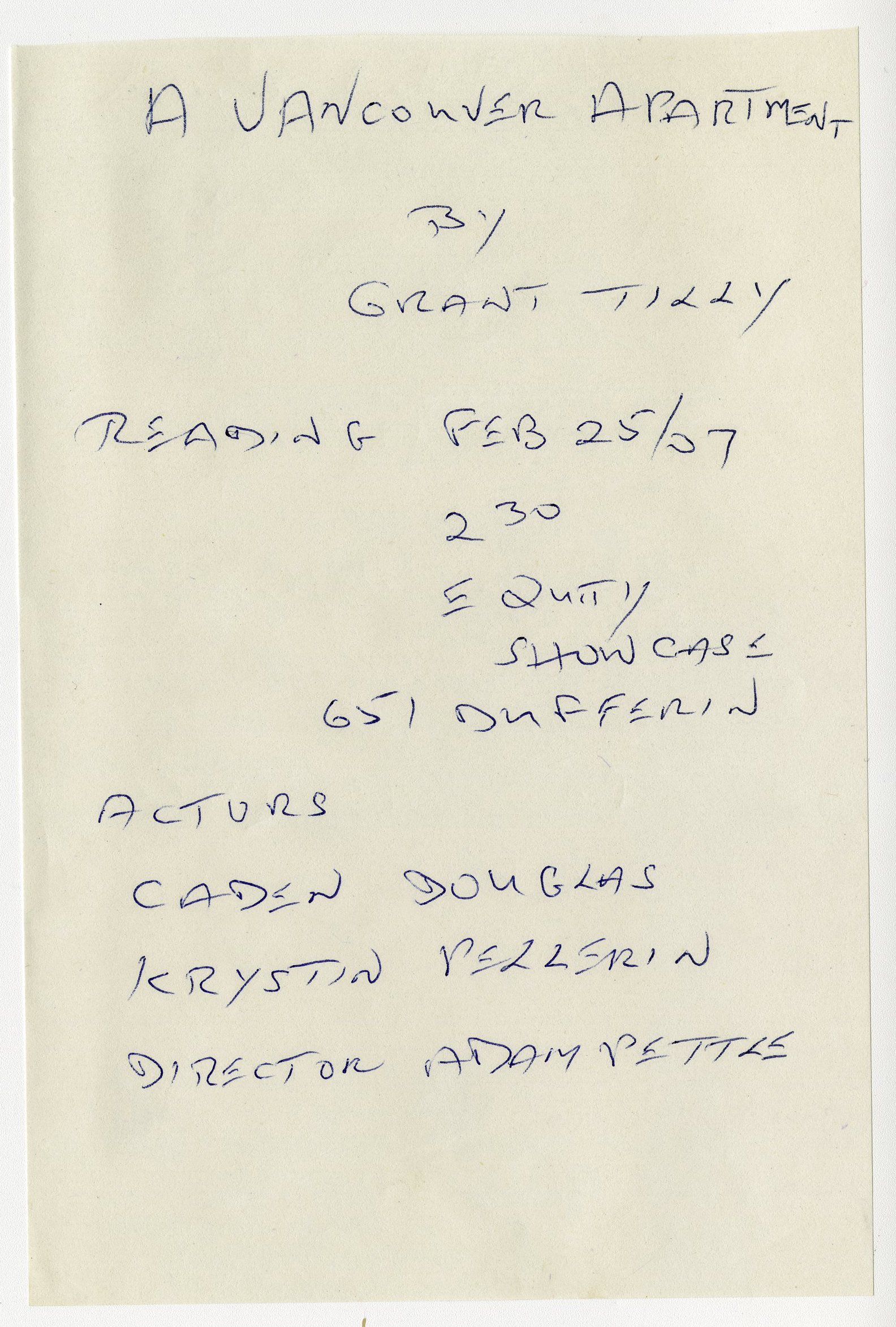
2021.12.56.15 – A note hand-written by Paul Christie detailing the company list for a reading of a play called A Vancouver Apartment by Grant Tilly, attended at Equity Showcase on February 25, 2007.
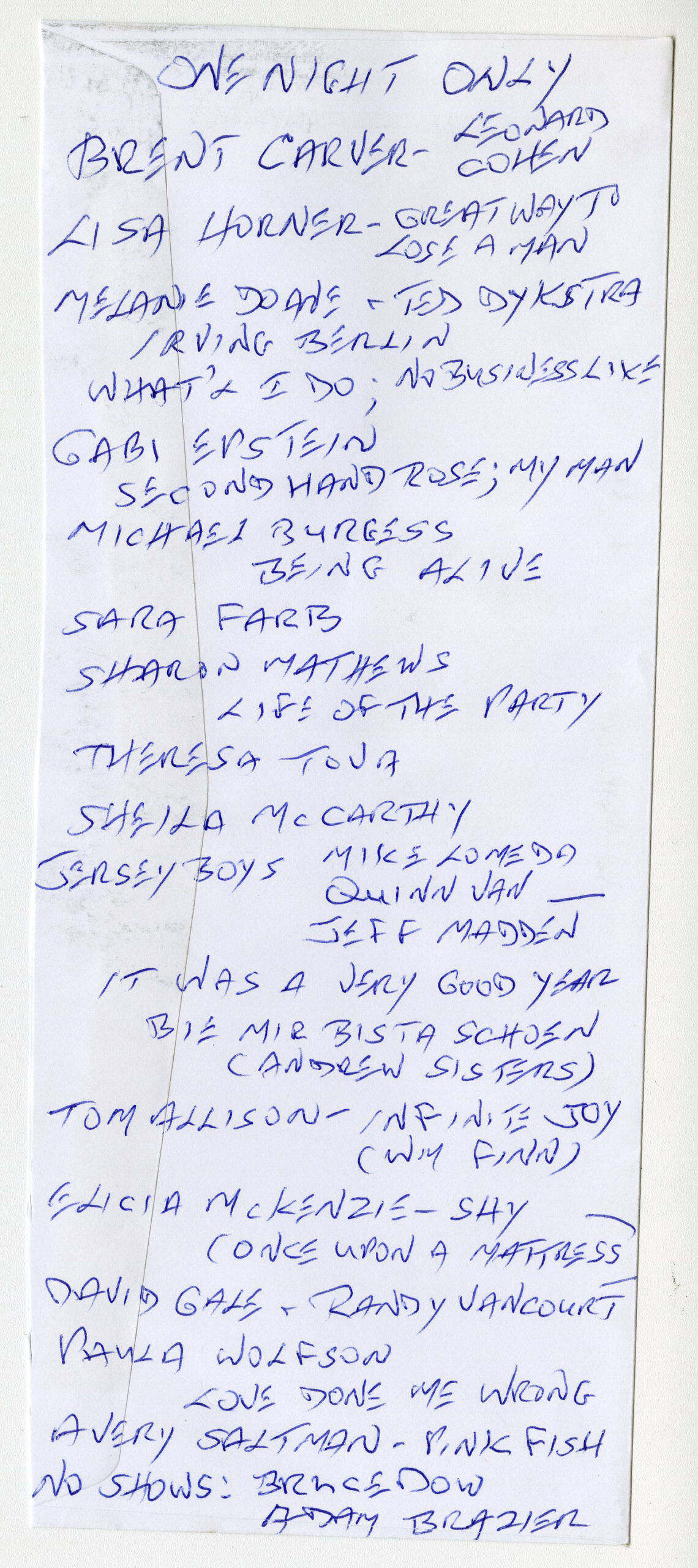
2021.12.58.136 – A hand-made programme on the back of an envelope for a concert called One Night Only, on which Paul Christie has written the names of all performers in this event, held at the Jane Mallett Theatre on November 16, 2009.
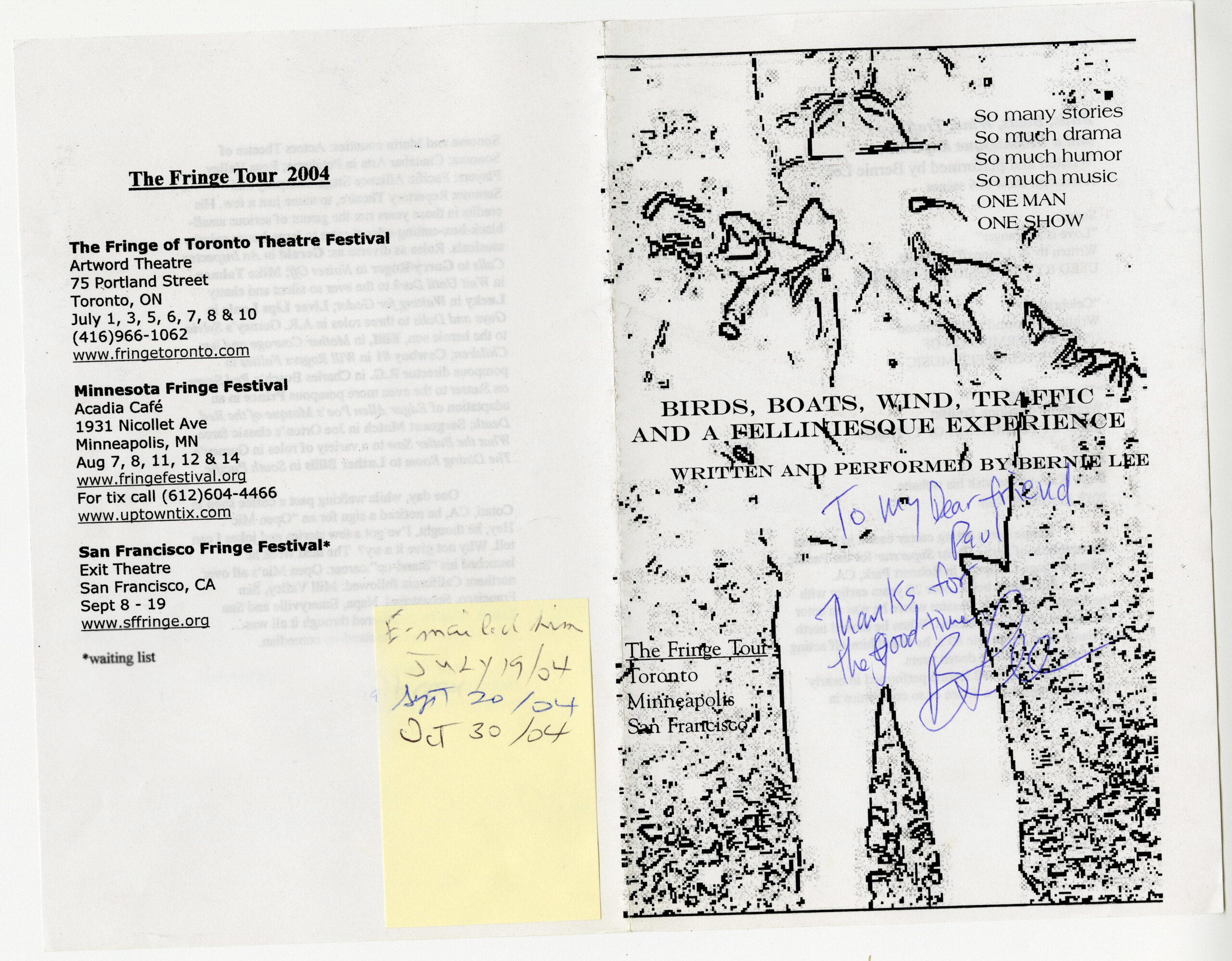
2021.12.53.59 – A program for a play called Birds, Boats, Wind, Traffic a Felliniesque Experience, by Bernie Lee, presented at the Toronto Fringe Festival in July 2004. Item is signed by performer Bernie Lee and included the performer’s email address (redacted), along with a post-it note where Christie notes the dates on which he emailed Lee after the festival.
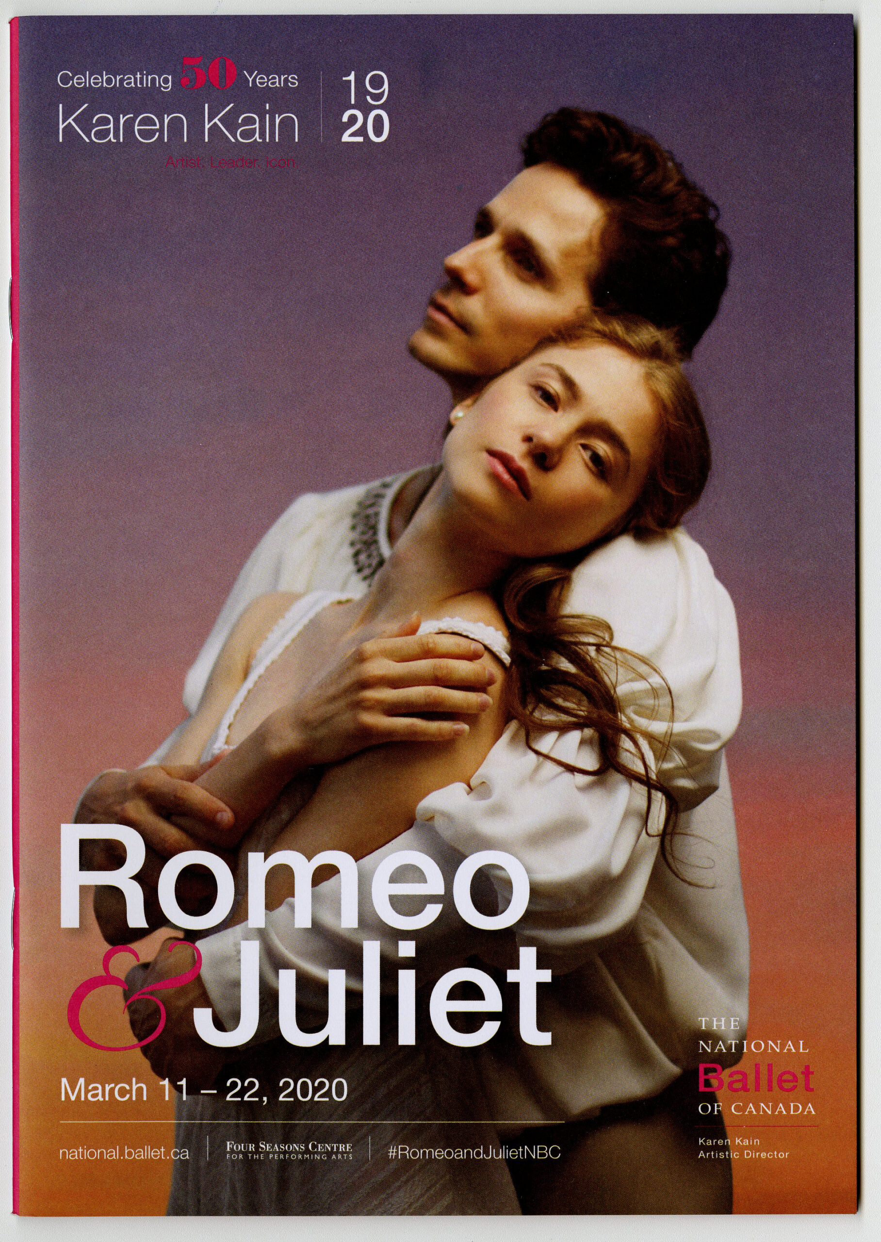
The final binders of Paul’s collection are heartbreaking in retrospect, because we know the world is about to change. In the first two months of 2020, Paul attended 21 performances, finishing with the National Ballet of Canada’s Romeo and Juliet at the Four Seasons Centre on March 12, 2020. After a lifetime of theatregoing, however, the COVID-19 pandemic abruptly shuttered the theatres and all at once closed the book on a lifetime in the audience. It is telling that Paul was so prolific until there were no more shows to see, and it must have been a devastating blow to lose this outlet.
When Paul passed away in October 2021, his love of the theatre proved central to how he was remembered by his many friends and family. We are honoured to preserve his lifetime in the theatre at the TMU Archives and Special Collections. After several months cataloguing this incredible collection, I feel as though I knew him.
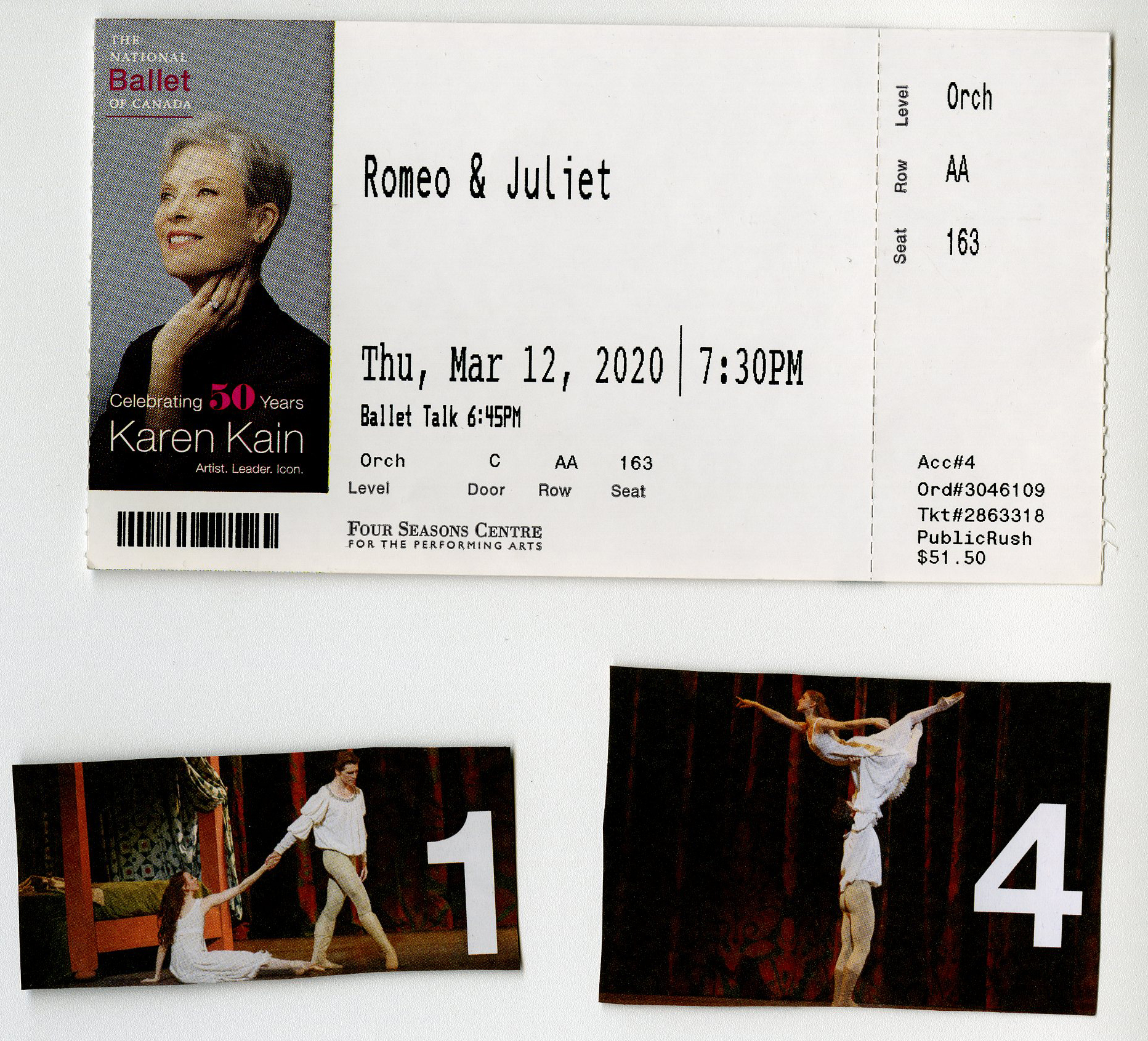
2021.12.69.19 – The final item in Paul’s collection: a program for the National Ballet of Canada’s Romeo & Juliet, presented at the Four Seasons Centre, attended on March 12, 2020.
2021.12.69.19 – Ticket stubs and clippings of this final performance.